National Kidney Foundation Case Study
When it comes to creating and implementing a design system, there are innumerable starting points. Some organizations may work backward from an already successful website. Others may begin with a newly articulated brand and aesthetic. At Sparkbox, we work collaboratively and flexibly with our clients to support their needs regardless of the jumping off point.
In 2019, Sparkbox partnered with the National Kidney Foundation (NKF) to lay the foundation for a design system that would drive the primary website as well as microsites and additional digital properties.
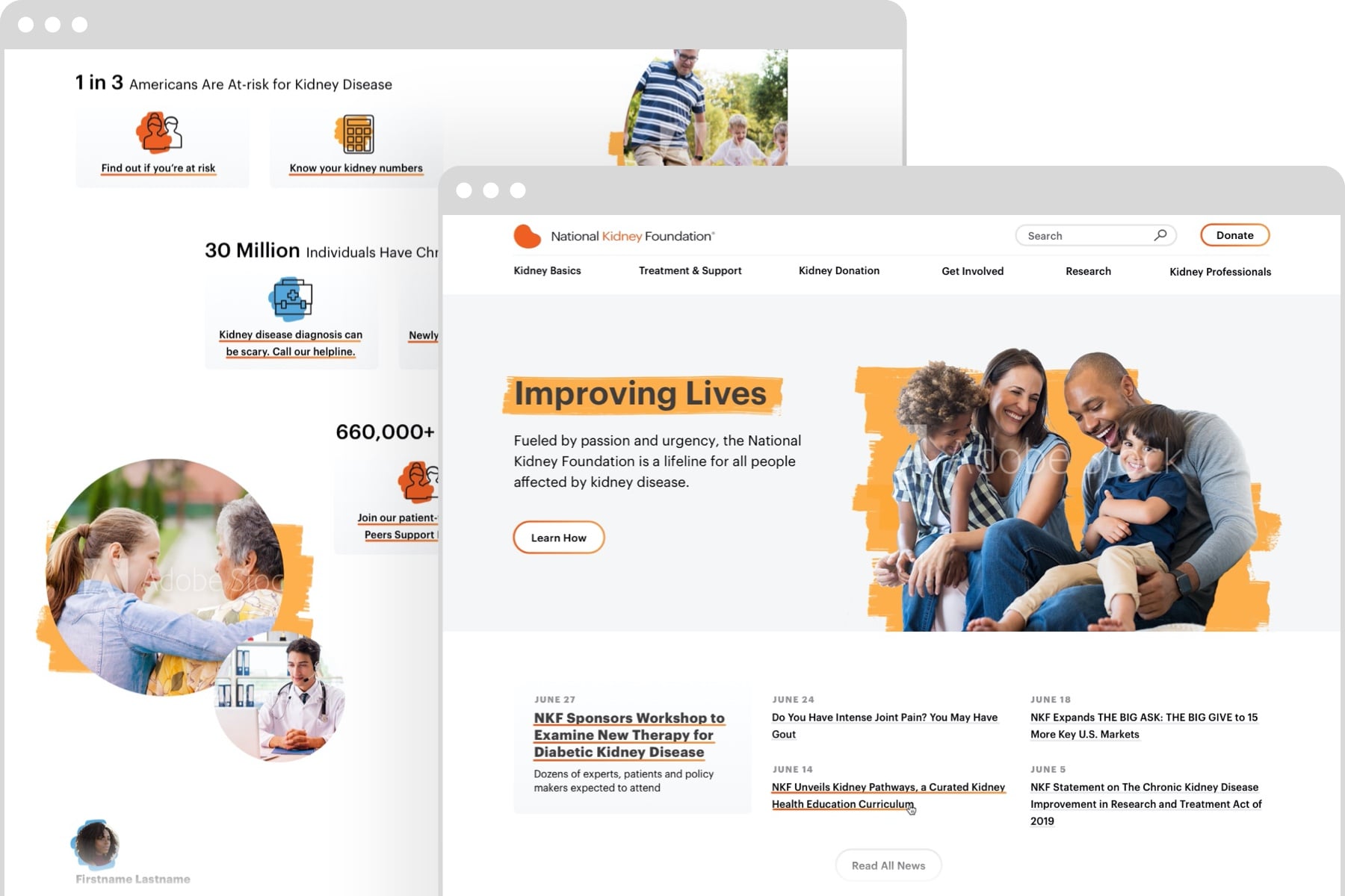
Headquartered in New York City, NKF is a nationally-known health organization focused on eliminating all preventable chronic kidney disease; making transplants available to all patients who want one; relentlessly advocating for a better quality of life and outcomes for all kidney patients. Simply put, they are leaders in the effort to fight kidney disease. The NKF website is the gateway to building connections with a wide array of audiences ranging from clinicians, researchers, patients, and caregivers to volunteers and donors. It was important to NKF that the design system create a seamless and consistent user experience across all properties, better engaging and supporting core audiences and moving users from awareness to education to action.
As we began the engagement with NKF, Sparkbox quickly realized that there were two potential barriers to a successful design system project. The first was content. Although NKF was thinking strategically about reusable components within the design system to support ongoing content needs, those needs had not been clearly defined. The second barrier was creative. Our meetings with the NKF team led us to suspect that while the project brief was to build on an existing aesthetic, refinement was still needed to build support with the full team. We addressed design and content challenges in parallel to ensure that the project stayed on track.
Initial Design
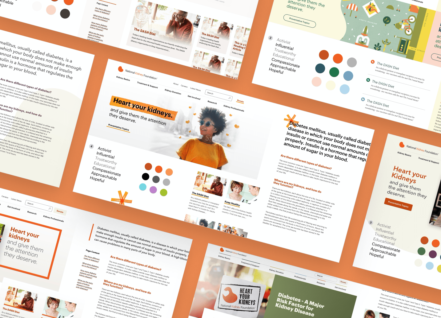
Once we understood that the team was not fully aligned around the existing design assets, we encouraged them to take a step back and think strategically about where to go next. We began with a list of visual vocabulary words, descriptors that helped us make sure that everyone was on the same page creatively. In this case, we discussed words like "activist," "educational," "compassionate," and "approachable." As we worked through exercises with the NKF team, we found that "activist" kept surfacing. This was a direction that felt important and achievable to the NKF team, but it didn't completely align with the comps and patterns they'd started experimenting with. We began working with element collages to flesh out how this keyword could be reflected in a digital design.
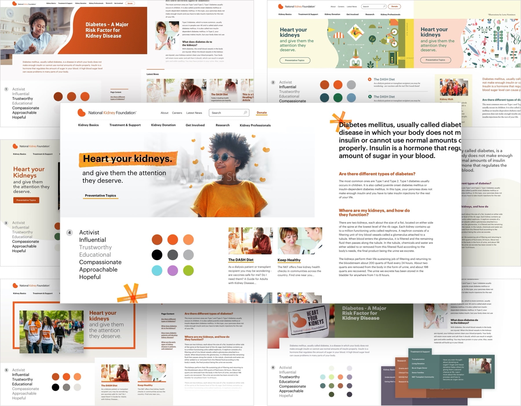
Sparkbox is always collaborative with clients, and NKF was no exception. We were working with a curious and insightful design team at NKF, and we were excited by their willingness to roll up their sleeves and really get involved with the design process. We created six element collages to fully explore visual directions. Each of the element collages focused on distinct visual vocabulary words and showed look and feel, colors, typography, photo treatments, and icons. After reviewing the collages with the NKF team, we honed in on a design concept that focused on the word "activist." This concept made use of hand-drawn elements and iconography which humanized the attitude of the site and made it feel less clinical. It also had the feel of a grass-roots campaign, something the team thought would resonate with the site's audience.
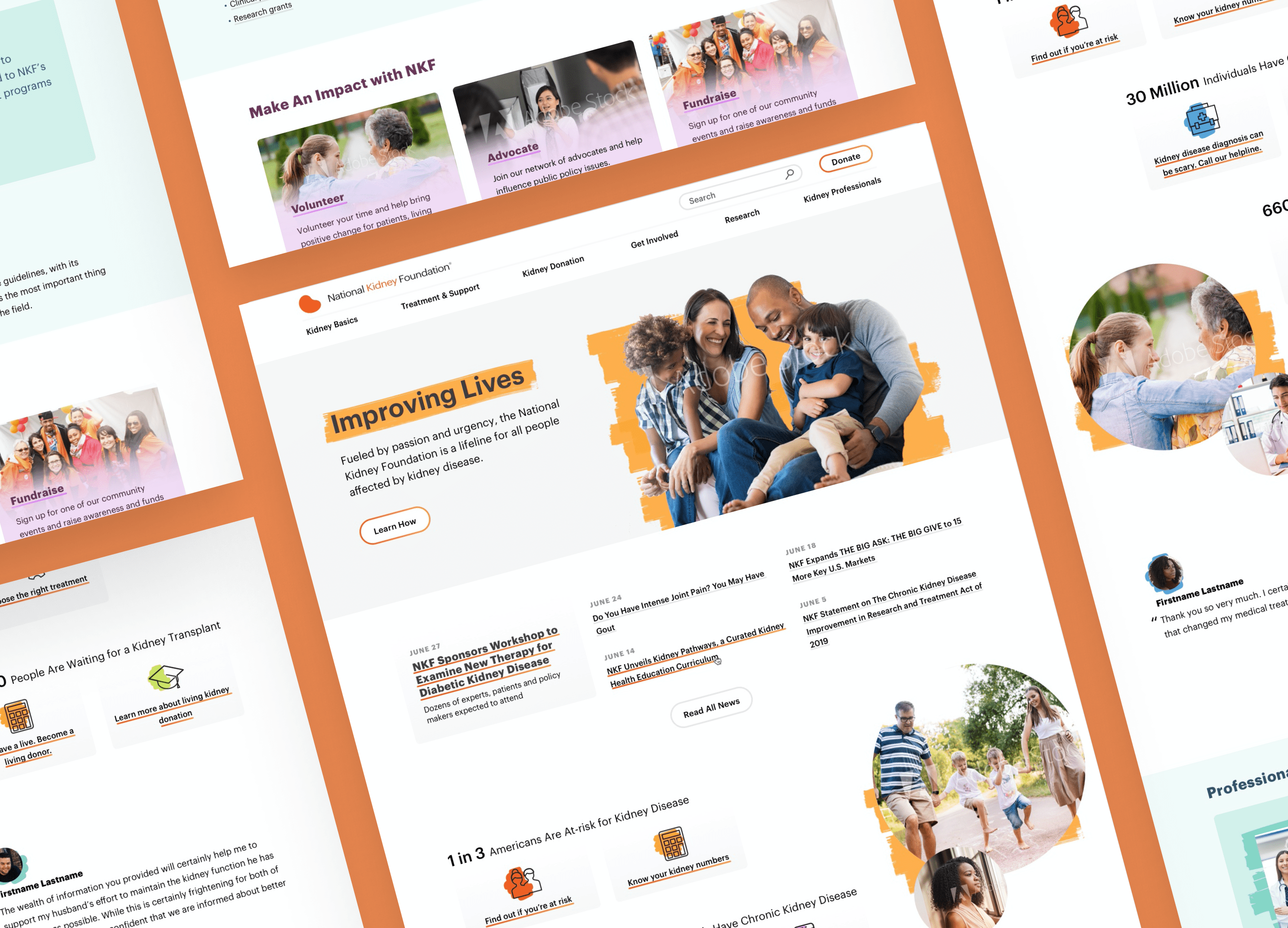
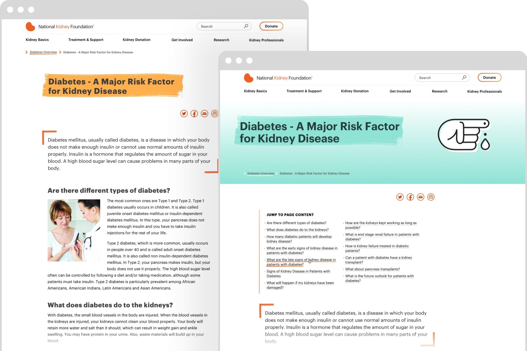
Once we brought NKF up to speed on Sketch, which we were using for the design process, we completely opened up our thought process and documentation to our NKF partners. Since NKF would eventually be taking over use of these design elements, it was very important to us that they were full partners in the creative process. We continued by creating page comps, exploring design treatments for the different types of content patterns the team had planned for. We started asking questions about the priority of content in order to effectively use visual hierarchy through type and color. As we asked these questions, it became clear that we needed to dig deeper into the content.
Content Planning
As noted above, content was under investigation at the same time. While some initial page mockups existed, we learned from our partners at NKF that the content being used on the existing site, and to some extent in the initial design comps, wasn't necessarily reflective of what they were looking for on the future website. We knew that in order to design a comprehensive system, we needed an accurate understanding of the content it would eventually contain. Before we could move forward, we needed to fill in some blanks. Great design must be planned with compelling content and clear calls to action in mind.
We identified the most critical pages on the site from a standpoint of organizational impact. We interviewed stakeholders and content owners for each of these pages (including the homepage) to better understand the role of the page in the user experience and the impact that the page should achieve. For each of these critical pages, we dug into how users would arrive on the page, what actions they should take on the page, and how content and calls to action on the page could drive financial and organizational success. We consolidated our findings from this investigation in a Google Doc, allowing us to firmly separate content from design for evaluation. The resulting content architecture for each of these pages helped us prioritize and organize content types, which could then be reflected in design system components.
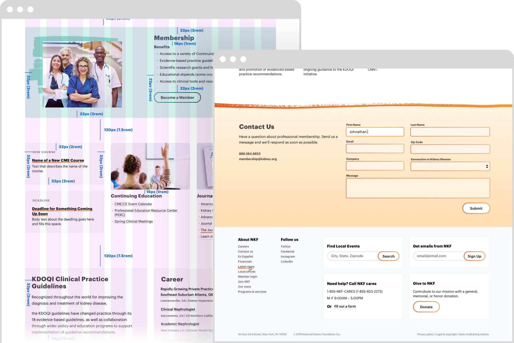
The insight we gained from this content exploration helped us to confirm the individual components needed for the design system. Working closely with the NKF team, we were able to extend the new visual style to specific page designs. We focused initially on interior pages with many content types, demonstrating the flexibility and range of the design system. In addition to providing design work for NKF, we were able to help level up their team with more advanced knowledge of content-first design, mobile and responsive design, and use of the design system. Our final deliverables for NKF were static designs. The NKF team did a fantastic job translating our work together into a vibrant site.
Results
The need for content exploration and additional creative work was unexpected, but Sparkbox is committed to following the project where it takes us in support of the client's long-term success. We were fortunate to be working with an open-minded and thoughtful team who were interested in doing the same. The fact that the in-house team has continued to evolve our initial design work is a testament to the importance of close collaboration between partners.
