A Mission We Believe In, A Place to Start
Blacks in Technology (BIT) is a tech-focused nonprofit normalizing the participation of people of color in tech. Since 2009, it has positively represented and connected black men and women who are either in the tech space or interested in the tech space, creating a far-reaching online community. The organization has grown to include chapters across the Midwest and East Coast, and continues to spread its influence.
Over the years our team has attended BIT events and even volunteered with the BIT organization. With a mission we believe in, we wanted to provide support. So when we asked how we could help them further thrive, we were excited to hear that a redesigned website was at the top of their wish list.
Blacksintechnology.net offers an abundance of resources that people can use to plug into community discussions, consume useful content, search the latest job postings, and even discover upcoming events of interest. When BIT Founder Greg Greenlee and the BIT leadership came to us, they had two major concerns with their outdated site: First, it was difficult for users to quickly identify what BIT did and why. Secondly, while content was prolific, finding it was labor intensive.
Knowing Where the Best Value Is
We strongly believe in open communication with clients and providing the best possible value. On any project, setting realistic limits is important. We worked with BIT to identify how we could best help the organization and made sure we could deliver on what we committed to. The goals of the project were twofold. One, create a website that clearly communicates what BIT does and why. And two, make it easy for users to find valuable content and resources. With goals like these, we knew that the biggest value we could offer would be to focus on the blog-like part of the site—with its hefty content produced by a hard-working group—and improve the way users navigate to find that content. Together, we made an intentional decision not to update BIT’s forums and jobs board due to one being an involved and robust plug-in with user logins, and the other being served through an existing system, requiring a completely different kind of solution and approach.
With analytics that suggested users tired of looking for the content they wanted and left the site, we knew content strategy was the place to focus first.
Making Sense of Content
The first thing we did was a content audit. Taking inventory of existing content on a content prolific, blog-based site is essential. We pretty much knew immediately that we’d have to trim and consolidate the categories. Slimming down from 38 to 10 categories put us on the path to a more content-accessible site. We also renamed “Categories” to “Stories” for friendlier, more user-intuitive language.
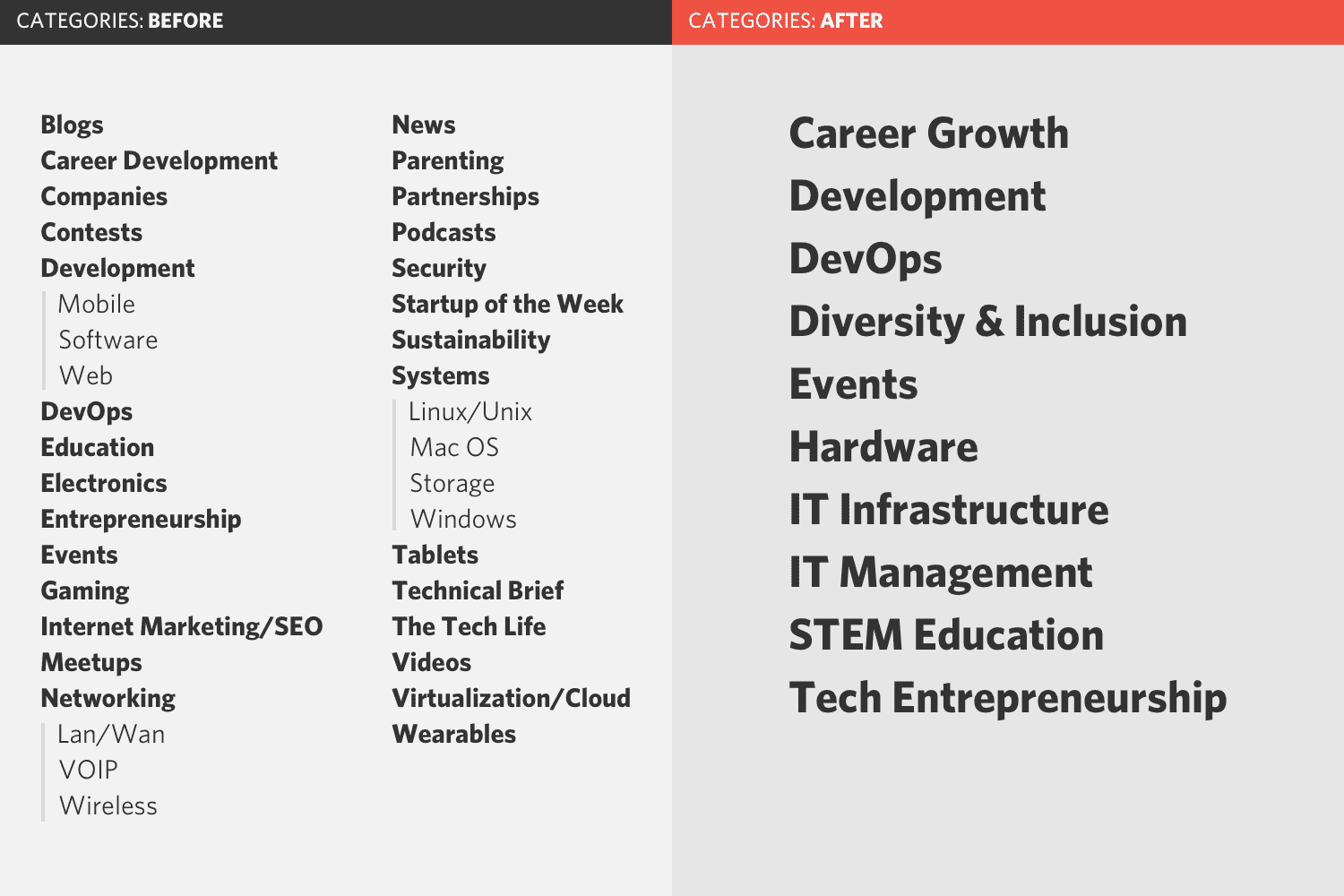
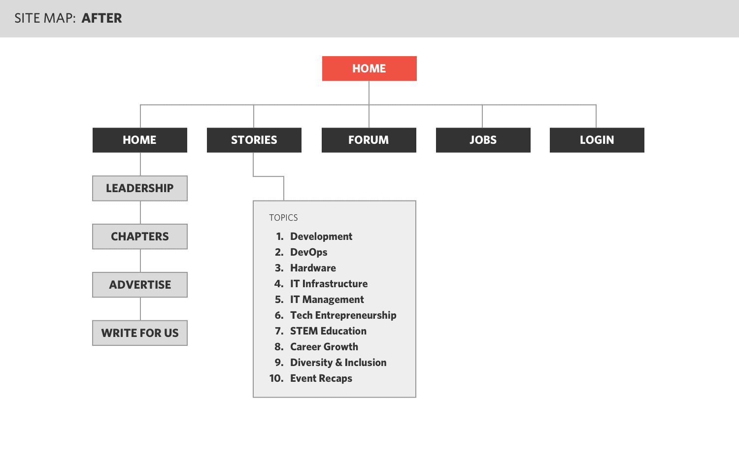
As we dug deeper, it also became apparent that users would likely want to navigate to desired content through media types. We moved “Podcasts” out of the main navigation and into the new “Stories” section. Surfacing it this way allows users to filter the blog-like content in a cohesive, tailor-made browsing experience. Now, users can easily find “Podcast” stories about “Career Growth” and more, for example.
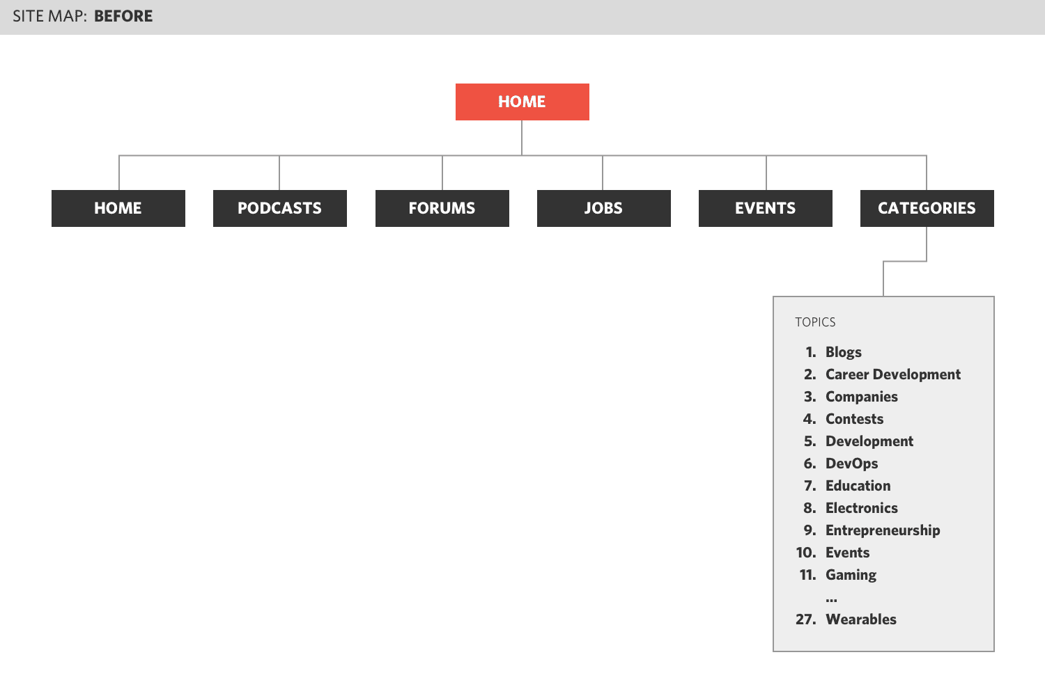
Navigating through categories before included a category selection at the navigation level.
Instead of navigating to the desired category via the top level navigation throughout the browsing process, we opted for a more convenient user experience: housing the categories—or story types—on the listing page. The ever-present listings and filtering make for easier resource browsing.
Surfacing BIT’s “Why”
In addition to creating an experience where users could easily navigate to valuable content, we were tasked with the goal of clearly communicating what BIT does and why. We understood that the right information architecture could help meet both of these needs. One way we honed the architecture was surfacing “About” in the main navigation and prioritizing it as the first item. We also refined architecture by working with the BIT team to create missing organizational content, like “Chapters,” “Advertisement Opportunities,” and “Write for Us.” These additions inform users on BIT’s vision and reach, and provide a clear path to further connect with and contribute to the community. We always need to account for growth and changing priorities so we also wanted to make sure we provided some flexibility to the navigation so that the BIT team could make those adjustments when necessary.
Another way we made sure to meet our main goal was to emphasize BIT’s purpose clearly and prominently at the top of the homepage.
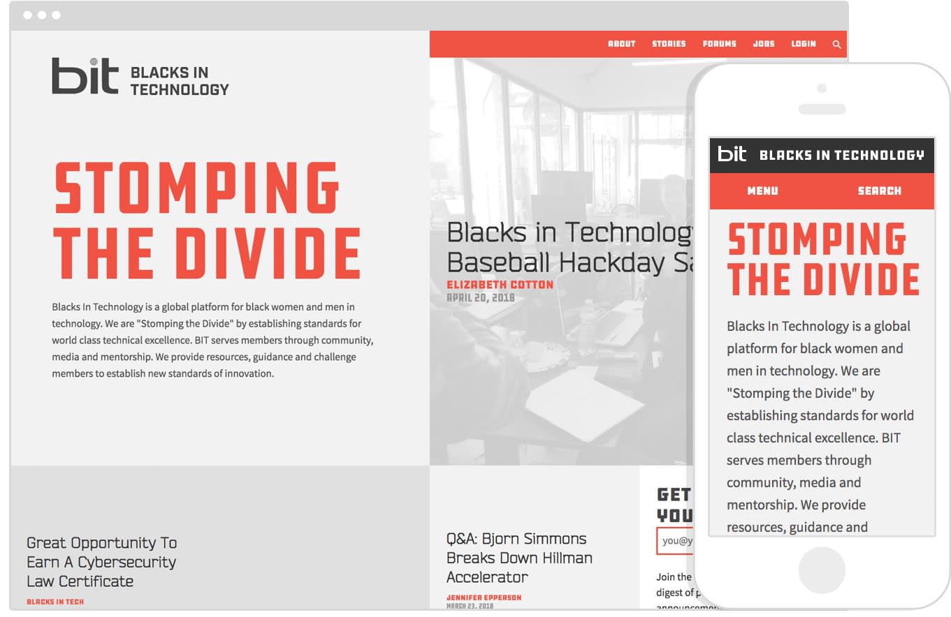
A Bold, Modern Design and Build
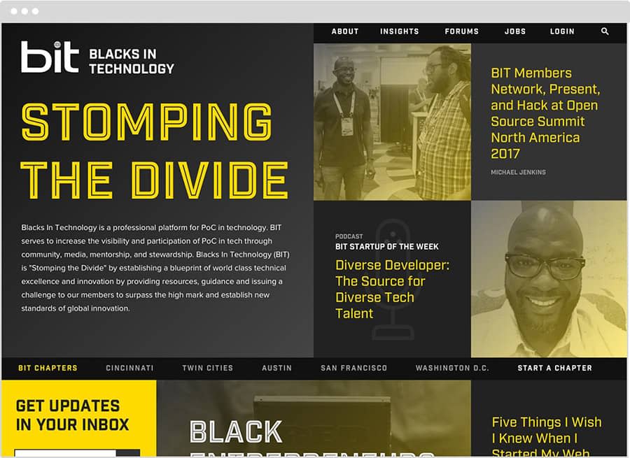
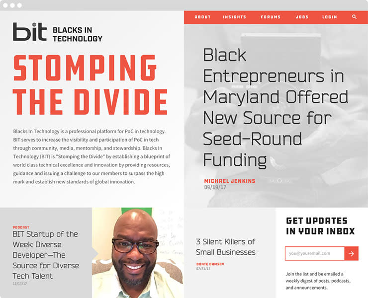
Once we laid a clear path for content and architecture, it was time to wrap it up in a thoughtful design. A few things were very clear about what BIT wanted to see out of this redesign, visually: They wanted a bold look, a cleaner, simpler interface, and to promote their writers. We explored different colors and fonts, and landed on the classic, bold combinations of black, red, and white. The fonts help evoke that boldness with DDC Hardware for headings, while Bender brings a retro techy feel to the post headings. The interior pages were designed with the intent on reading. On these pages, the design opens up and gives plenty of space for the text to be the star.
Since this is a site for technologists, we wanted to push ourselves with the latest web technologies whenever it made sense. To start, the site’s grid layout was inspired by our desire to rely on the new CSS Grid standard. We had dabbled with CSS Grid on other projects, but never really used it for full site design as we did with the BIT site. We also utilized filter on the feature story image to give that subtle light grey background, followed by mix-blend-mode on :hover to create the background image’s striking red and black duotone. This project’s design process of this project really spoke to the capabilities of our design culture, particularly in our exploration of how design intersects with development.
Value to Build From
With any project, we strive to find the areas where we can add the most value, and then do those things really, really well. A strong, open dialogue with our clients is the best way to make sure we thoughtfully and strategically identify and deliver on the right value. We’re thrilled to have had the chance to work with the BIT team and to see them carry forward the work we started together.
We encourage you to learn more about BIT and how you can get involved in Stomping the Divide.
