In 2022 and 2023, Sparkbox partnered with a Fortune 500 company to design a world-class corporate website that would seamlessly connect critical information to key audiences while communicating our client’s dedication to innovation, global sustainability, and the community. While this century-old company has traditionally been focused on manufacturing, it’s now shifting to connect products with technology for the betterment of its customers. The team understood that a strong digital presence is part of every communication strategy today.
This engagement is an excellent example of a complete client journey with Sparkbox. At the onset, we knew this effort would span all three phases (onboarding, iteration, and offboarding) within 10 months.

Initial Request
Our conversations began with a request for two Sparkbox developers to support the client team in building a new website presence using their existing information architecture (IA), page structures, and content as-is. As discussions progressed, it quickly became clear to us and the client that this website needed more than just an engagement focused on development. Although we had the resources and expertise to give them the help they requested, we knew that many of the pain points they discussed would not be addressed unless the complete user experience was evaluated. Because of this, we proposed starting with an onboarding phase to explore how we could truly solve the right problems their website needed to address.
Phase 1: Onboarding
Onboarding is an exciting step that provides learning, discovery, and directional clarity for Sparkbox and our clients. Initial stakeholder interviews highlighted priorities, goals, and preconceptions. A review of their existing website, demographics, and competitors allowed us to expand on the knowledge gained from those interviews and shape our approach.
We provided some preliminary findings from the auditing process, noting that we were just scratching the surface of their opportunities. Our onboarding proposal’s short-term, fixed-rate setup allowed us to explore all the possibilities and solve the right problems together.
We started a comprehensive research effort to gain a complete understanding of the challenges and opportunities ahead of us:
Technical Audit:
Review of the technical components of the project in order to ensure alignment with technical objectives throughout the projectHeuristic Evaluation:
Assessment that helps to identify usability problems in the user interface design.User Testing:
The process of evaluating the interface and functions of a website, app, or product, by presenting real users with specific tasks in realistic conditions.Accessibility Audit:
Review of a site’s alignment with WCAG 2.2 guidelines, which are the recognized set of recommendations for improving web accessibility.Competitive Audit:
A deep-dive into direct and indirect competitors to assess the strengths, weaknesses, and unique features currently in the marketplace.Stakeholder Interviews:
One-on-one conversations with people who have a vested interest in the project’s success.
Using this research, we collaborated on our findings, presenting a SWOT (strengths, weaknesses, opportunities, and threats) analysis along with recommendations for an overall approach and optimal goals that were shared with our stakeholders and up through the executive team.
The Revised Request:
After reviewing our findings, it was clear that the story communicated on the client’s current site did not represent who they were. As a company dedicated to innovation and future thinking, it was critical for the website to provide a modern and polished platform to share their efforts and vision with investors, partners, business customers, and job seekers.
We developed a proposal outlining our recommendations to build a site with the new vision. It included in-depth research, interviews, usability testing to identify optimal user flows, IA, and page structures. This effort would ensure that we create a web presence telling the story of their history, their focus on the future, and their dedication to sustainability and the global community.
With the realigned focus and priorities in place, we determined with the client that Sparkbox would handle the UX and design, and the client’s internal development team would take on the development effort up to and beyond launch. To ensure the engagement’s success, we budgeted time for one of our technical directors to advise, document, and educate their internal development team on implementation and accessibility best practices.
Phase 2: Iteration
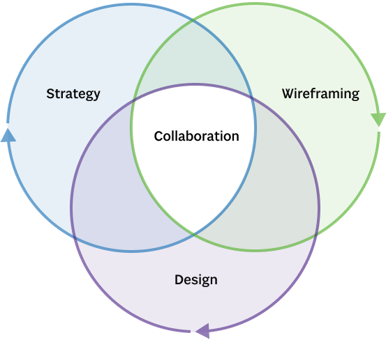
With a scope of work and timeline in place, we broke up our iteration phase into three sub-phases: strategy, wireframing, and design. Each subphase would require an iterative loop, and, where possible, we would overlap efforts for efficiency.
Strategy
Our strategy leveraged the information collected during Onboarding to identify key learnings and the gaps required to create a user-centric plan for the site. We conducted additional stakeholder interviews and competitive audits to ensure the proper focus and direction.
Using this information, we developed user flows for key audiences and comprehensive sitemaps to illustrate the optimal structure of the site. Iteration on this effort unveiled an unexpected learning that greatly enhanced our approach to the site. The existing site had an extremely high page volume, and we designed early iterations of the site’s IA to empower users to gain access to the information available as quickly and seamlessly as possible. However, after collaboration with stakeholders, we concluded that many pages available were actually unnecessary and, in many cases, counter-productive to telling the client’s story.
The final proposed information architecture significantly reduced the number of pages on the site, redirecting users to the information they would need. This effort created a clean and streamlined site experience and helped the client feel empowered to maintain the site efficiently after launch.
Wireframing
With the strategy and IA in place, we shifted our focus to wireframing to iterate and align on page flow and content length for critical information points throughout the site.
In addition to creating a seamless experience for users, the scope of work included building a flexible system that their internal team could use to create new design layouts in Figma, iterate based on post-launch data, and quickly adapt new learnings to the live site. Using the established brand focus, user flows, IA, and content priorities, we built rough wireframes to define the content flow of key pages. We then evaluated the rough wireframes to identify common approaches used to communicate information across the site.
This evaluation identified opportunities for flexible modules that the client’s development team could build once in the CMS and apply (with a set of variables) to accommodate similar content needs throughout the site. Creating these components in the wireframing subphase allowed us to iterate on the modules quickly. We established which variables would be necessary for each and how they would apply to various page implementations.
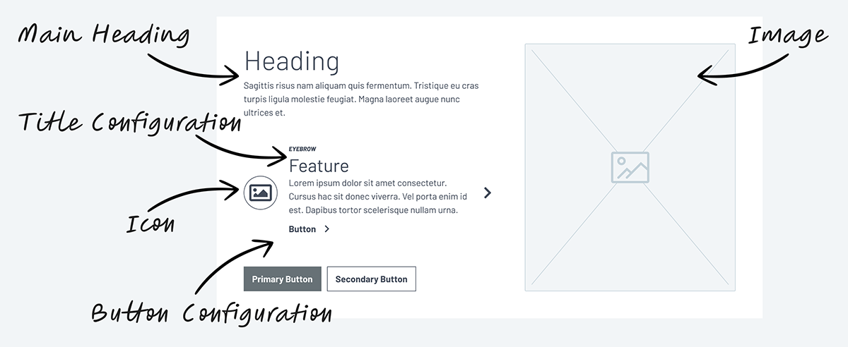
Example of Flexible Options for an Individual Module:
Design
Our design effort began with an in-depth review of their design system and discussions with their team to understand the best ways to use the system and opportunities to give the corporate site a unique approach within the brand ecosystem.
Using the design system as a foundation, we narrowed our design efforts to two main areas of focus. The first focus took the direction established from the IA, user flows, and wireframes to design flexible modules that adapt to various layout requirements. We then assembled a set of page layouts to demonstrate design application and approach seamlessly.
The second focus was to design a fully custom page dedicated to the company’s commitment to global sustainability. This page required elements that would visually stand out and engage users by creating a unique experience while still adhering to the design system established for the brand.
We utilized a multi-faceted, iterative process: developing and collaborating on layouts for key pages as well as the flexible module components used to accommodate all pages throughout the site. The result of this iterative process was a comprehensive Figma library complete with dozens of modules broken up into ten separate categories, along with nine responsive layouts covering a variety of objectives, audiences, and content depths. Typically, our UX/UI designers would collaborate with our developers to build out the templates. In this case, however, the client’s development team would be responsible for building the modules, making the offboarding process especially important.
Phase 3: Offboarding
Offboarding was particularly important to the success of this engagement. Careful planning is critical whenever our team needs to hand off work before launch. First, we collaborated with the client’s entire team to align on their strengths, concerns, specific needs, and questions. We then collaborated internally to ensure a comprehensive delivery.
We structured our documentation and files to address their concerns and questions, combining all components, documentation, layouts, and design customizations into a single file to streamline workflows and consolidate information.
We conducted three separate engineering handoff meetings, each focused on specific page types and applications, reviewing content models and suggestions for implementation within the CMS. Then, we finished with a comprehensive handoff overview with all team members to walk through each element of the delivery files, demonstrate optimal workflows, and align all documentation to ensure the client’s team was comfortable with taking the site to launch.
Conclusion
This engagement is an excellent example of how effective collaboration can elevate both quality and efficiency. Sparkbox strategists, UI/UX designers, project managers, and developers collaborated together and with the client’s team from initial research and data gathering, to the final polished design, documentation, and handoff.
Working together throughout the process allowed us to iterate quickly, seamlessly adapting to new ideas, input, and requirements while maintaining our targeted timeline. We look forward to seeing the final developed project later this year, and are eager to work with this incredible client again on future engagements!
