
The chart image above represents productivity over time in the design steps of establishing the aesthetic, solving the problem, and refining the solution.
For some time now, the mystery of “designing in the browser” has haunted web designers around the world. Andy Clarke was the first person I remember speaking about this, but since 2008, this idea has polarized our industry. At Sparkbox, we see designing in the browser as one of many tools needed to be successful in building for the web today. The question then becomes, “How do we advance design through a more collaborative web process given the tools we have at our disposal?” In order to make good decisions about our tooling, we need to dissect design.
Establish the Aesthetic
In the past few years, we’ve recognized the danger of jumping headfirst into full-comp design before we really understand the design direction. Other disciplines have recognized this for a long time—think mood boards in branding—and taken steps to ramp up their design effort. The goal here is to establish the basic building blocks we’ll use in the rest of the design process: things like color, type, texture, illustration style, photography treatment, iconography. Once these are established, the success rate for the rest of the process is greatly increased. There are a number of ways to do this on the web; let’s look at a few.
Style Comparisons
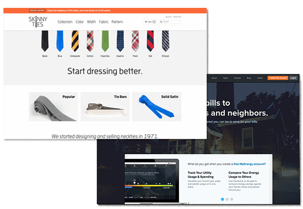
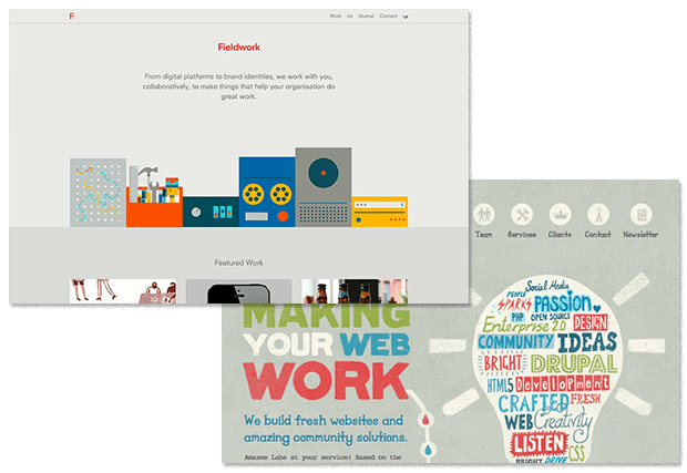
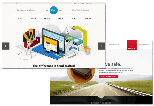
My friend, Dan Mall, shared this idea in our presentation at the first Artifact Conference. He’s also written about this idea in the context of working with a contractor to build a new office space.
I could create an illustration or a 3D rendering of what I want my new office to look like, but that doesn’t take advantage of [the contractor’s] great ideas. It’s dictation, not collaboration. Instead, I show him a Pinterest board my wife and I created. I tell him that I love these beams or this mix of materials and we can have a conversation. I revise my ideas through his expertise, and vice versa.
In the context of the web, we might start the conversation with our client by showing opposite variations of these basic building blocks, asking these kinds of questions:
Would a dark site or a light site be better for your brand online?
Would an illustrated style or photographic style work better?
How about a flat look or a textured look?
And, ideally, we don’t just ask these questions; we show them some options. In a matter of a few hours, any reasonably talented designer can put together a presentation with opposing examples of these questions. Giving our clients a series of visual A/B options can often help us identify the appropriate direction very quickly.
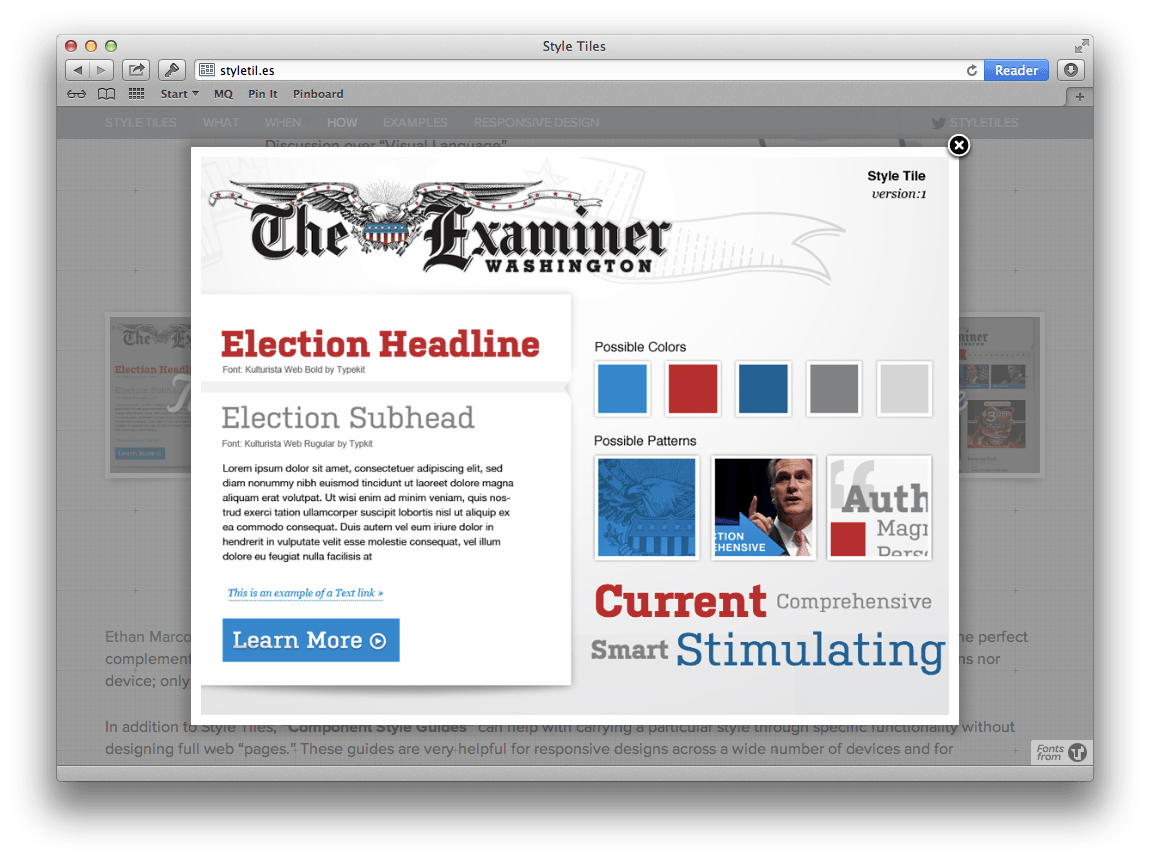
Style Tiles
Samantha Warren introduced the idea of “a mood board for the web” when she created Style Tiles. She defines them as:
...a design deliverable consisting of fonts, colors and interface elements that communicate the essence of a visual brand for the web.
She creates these in a static design tool and exports them as images for her clients to review. Often, she’ll create several for a specific project to present a variety of options, again with the goal of determining the design direction—establishing the aesthetic.
Style Prototypes
Rob Tarr and I had an opportunity to hear Samantha present style tiles at SXSW Interactive in 2012. The concept made a lot of sense to us, but we left that presentation with the idea that this could just as easily be done in the browser. Shortly after, we started using style prototypes at Sparkbox and have never looked back.
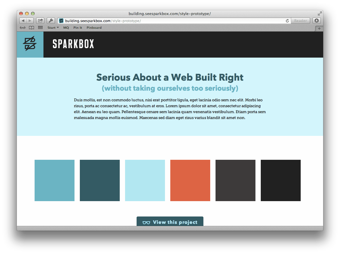
Essentially, these are very similar to a style tile but built with HTML and CSS. We’re able to get the same benefits of style tiles, but with the added ability to show real web type, demonstrate more accurate color, and introduce the conversation about browser support very early in the process. We ask our clients to review them in their browser of choice, which means they can open them in old IE or on a small screen device—whatever they prefer. Not only are we establishing a solid design direction, we’re combatting the problems that static design deliverables introduce by managing the expectations of our clients. We have several of these online for anyone to take and use or modify as they need.
One additional benefit of doing this in the browser is that these style prototypes can evolve into pattern libraries for your project. There are many benefits for providing your customers with a simple method to view all the components in their design system. Dave Rupert said it best: we should be delivering “tiny bootstraps” to our customers.
Guiding Decision Principle: Comfort
In evaluating what tools to use to establish the aesthetic of a web project, I believe the most important factor to consider is comfort. At this point in the process, you need to explore possible design directions with your client. Doing so in a comfortable way as you learn how to work with this specific customer can help establish a great foundation on which to build a long-term working relationship.
Much of the conversation around design deliverables in responsive ends here. However, once we’ve established the aesthetic, there’s still a lot of work to do. Let’s talk about solving problems.
Solve the Problem
I’ve been amazed at how often those outside the discipline of design assume that what designers do is decoration. Good design is problem solving.
This quote from Jeffrey Veen sums it up nicely—“good design is problem solving.” If you’re a designer, you know how true this is. The bulk of the work of design is done here, so we need to carefully evaluate the tools we’re using to solve design problems.
Static Design Tools
As I’ve had the opportunity to ask people what tools they use to solve design problems, mostly the answer I get back is a static design tool. It’s really no wonder: people have been doing this for a long time—this is comfortable—and change is hard. There are always the standards: PhotoShop, Illustrator, InDesign. However, there are also a whole crop of new design tools that cost (and do) less than the suite from Adobe. Acorn, Pixelmator, and Sketch are just a few. These newer static design tools tend to cost less than $100 and brag about their “non-bloated” feature sets.
Also, most designers still rely on paper and pencil (or whiteboard and dry-erase marker) to quickly convey their ideas. We do this quite a bit at Sparkbox, and I often find myself taking pictures of whiteboards to save these ideas with the rest of the project files. This can be a fantastic way to iterate on design ideas in a collaborative setting, and it’s an indispensable part of our process.
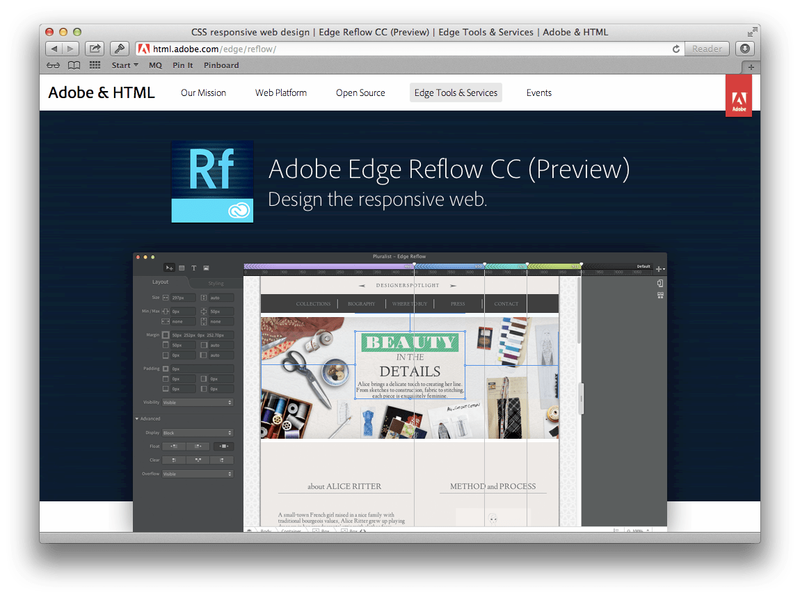
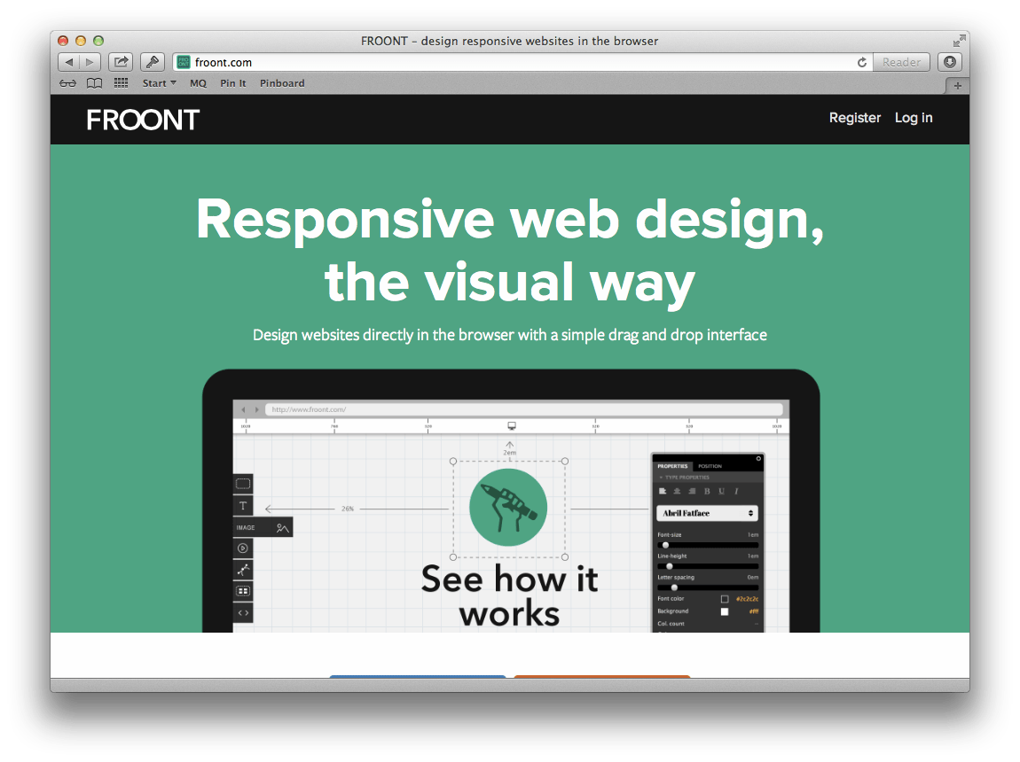
RWD-Specific Tools
There is a new crop of “responsive design tools” on the market now as well. Adobe has been touting Adobe Edge Reflow as a tool to “design the responsive web.” Froont is a web-based, drag-and-drop interface for creating responsive HTML and CSS. And more recently, Macaw made quite a splash, encouraging us to “stop writing code” and to “start drawing it.”
Most of these tools are a hybrid of pixel-pusher and text editor. They allow you to create grids, set breakpoints, import and manipulate assets, and export HTML and CSS when you’re done. They also allow you to control the style of elements using the properties of CSS that you’re probably familiar with.
The kind of feedback I’ve generally heard about these tools so far is that they’re great for rapid prototyping but not ready for generating production code. I do believe that our industry’s obsession with “handcrafted” code is hugely beneficial but also that it precludes us from giving these tools a fair shake. Regardless, it’s quite exciting to see people striving to solve the problem of flexible design with a UI that hopes to even the playing field. So far, in my opinion, there’s no substitute for knowing the intricacies of CSS and being intentional about how it’s written and structured.
In-Browser
Finally, some are able to jump into their favorite editor and solve design problems with text. Combine a fantastic text editor like Sublime Text, VIM, Coda, or Espresso with a modern browser, and—in the hands of the right person—magic can be made.
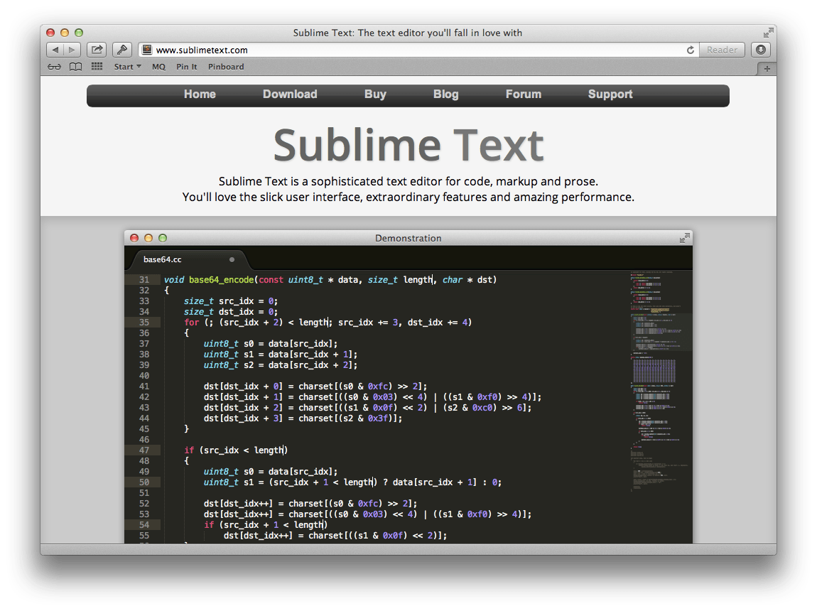
Throw in the developer tools shipping with those browsers and a front-end developer framework or two, and this becomes a seriously legitimate option
Guiding Decision Principle: Fluency
I believe many people in our industry struggle with “design in the browser” simply because they aren’t fluent with the tools needed for working that way. I’ve heard many people say, “Happy accidents don’t happen in code like they do in PhotoShop.” I can testify that this is absolutely not true. Instead, I believe it’s about where you are the most fluent.
As we evaluate the best tools for the monumental task of problem solving in design, I keep coming back to the idea of fluency as a solid principle on which to base the decision. You can’t write poetry in a language you don’t speak. Similarly, you can’t craft design using tools you’re not fluent with.
It’s also important to draw a distinction in the “solving problems” mode of design between solving layout problems and solving component problems. Brad Frost has written about this recently and others before him (check out 34 minutes in). We do draw this distinction at Sparkbox. I’ve seen that we do a lot of hand sketching in our early thinking about layout, whereas we tend to use static design tools (currently PhotoShop or Sketch) to work through design for modules. What’s primarily important is that you solve design problems where you, your team, your project, and your client need to.
Refine the Solution
At some point in designing for the web, we cross the threshold of problem solving and shift into the refinement of the solution. On charts like this, it’s usually called the long tail, and it can go on forever if you let it. Designers, in particular, will move pixels around, shifting and tweaking their design until it’s perfect. I’m not suggesting that this care for the detail of a UI is not critical, only that we must shift into the final medium—the browser—when this refinement takes place. Otherwise, we’ll have to refine twice, and most people don’t want to pay for/waste that time. In order to combat this waste of time, we’ve made a conscious shift toward design pairing.
Design Pairing
At the time of this writing, we have 20 people working regularly in our office. By title, we have one designer, our Creative Director Jeremy Loyd. Jeremy sets the design direction and begins the design problem solving for every project we have. Then, he pairs with our front-end developers to carry out the design in code.
We also happen to believe that front-end developers must have a very keen design sense, and so this is part of how we hire for that role. This gives Jeremy the ability to trust that his design intent will be honored as new problems are solved in the browser. Then, when it’s time to refine the solution, Jeremy can work very closely with our front-end team to refine in the final medium.
Guiding Decision Principle: Efficiency
We have based our decision to avoid static design tools during solution refinement because of a desire to be efficient with our time. As the graph above indicates, this takes a lot of time with a small amount of actual change (even though the value of that change is arguably high). Because of this, efficiency is a critical factor in determining what methods to use for refining your design solution.
Unfortunately, understanding the impact this can have on efficiency doesn’t make it any easier to determine when you’re switching from solving the problem to refining the solution. The ability to recognize this switch is something that must be learned. And, it’s not easy for anyone other than the designer to tell, which means it takes trust on the part of the team and discipline on the part of the designer. In the end, it’s absolutely worth the learning—your customers will appreciate the added efficiency, and your team will enjoy shipping faster.
Your Process for Your People
I’m constantly reminding myself that these kinds of articles can be dangerous. What I’ve documented above is what’s working for Sparkbox today, but every project is different. Many times, we find ourselves veering from these guidelines simply because of a customer’s budget or timeline. With so many factors to consider, there is a level of improvisation needed to figure out what is appropriate at any given time. Taking into consideration the project, client, timeline, budget, stakeholders, and team members will help you clarify the ideal way to approach design on any given job.
Seeing the separate modes of design as somewhat distinct activities opens up the possibility of combining tools to be the most effective and efficient. We’re always looking for ways to improve, and we’re hopeful that sharing what we’ve learned is helpful for you.
Have other ideas on how to handle design in the flexibly complex world of web design? We’d love to hear!
