
At Sparkbox, we are always excited to work on a website that we love to visit ourselves. So when Farnam Street, “an online intellectual hub that helps you get an edge, avoid problems, and live a smarter life,” asked us to help build its online brand through a custom microsite, we jumped at the chance. We were tasked with taking their current microsite from a generic template to a classic, timeless design that would serve as a foundation for their overall brand. Because Farnam Street is a heavy text-based site without many existing identity elements, we knew creating a recognizable experience would take considerable thought and craft.
Farnam Street offers readers tools, ideas, and frameworks “to help you go to bed each night smarter than when you woke up.” The goals of the redesign, as Farnam Street Founder Shane Parrish put them, were: “Improve the aesthetic—the look and the feel of the website, advance the brand without abandoning long-time readers, and give Farnam Street readers a better overall experience delivered on the platform of their choice.”
We were immediately drawn to Shane’s desire to prioritize his readers throughout the process. And so, we began work.
Our Design Approach
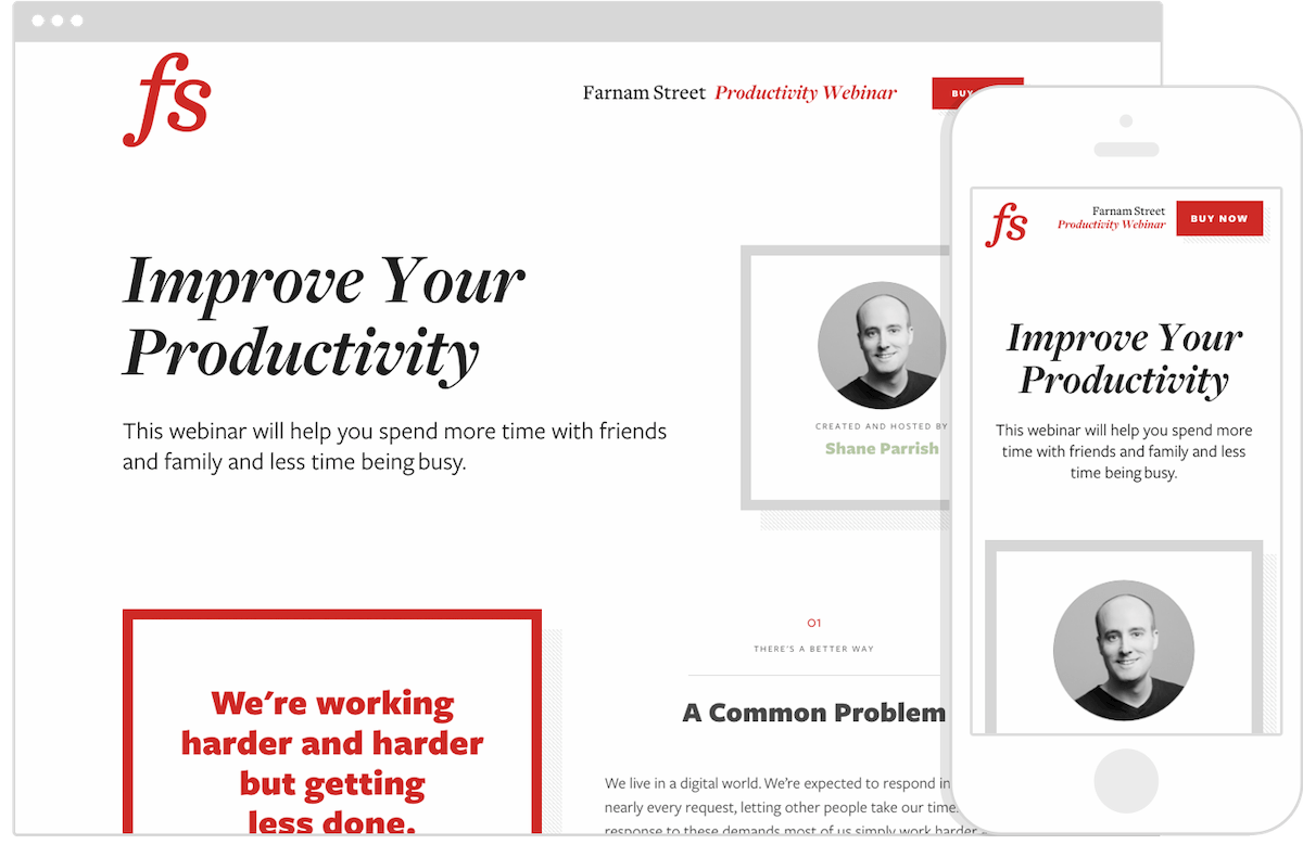
Since one of the goals of the project was to establish the look and feel for the entire brand family, we went to work on crafting a strong visual identity for the Productivity Webinar site. Whatever we created needed to be flexible enough to seamlessly apply across all Farnam Street’s current and future products while maintaining a cohesive brand experience. And the identity had to accomplish the overall goal of feeling timeless and classic while also identifying reusable design patterns for future Farnam Street web properties.
Creating a Classic and Cohesive Brand Experience
Farnam Street dedicates itself to quality, engaging content, so we began by exploring typography—a critical part of the brand. Super font families were on our radar because they offer a wide range of weights and styles that look great individually but pair together nicely as well. We settled on Freight, a family of fonts with just the right mix of modern aesthetic and classic readability for this project. Further, all the styles and weights in the Freight family were created to be paired together, which gave us ultimate flexibility for future sub-brands while also allowing for variations and complexities to our font combinations.
Our first designs revolved around a lockup of the Farnam Street name and a specific sub-brand, in this case the Productivity Seminar. From a brand perspective, we felt we needed a visual way to communicate that each product was related to the Farnam Street brand.
We continued to tinker in Sketch, building and iterating on individual content modules, and intentionally not spending time designing the entire page so that we could get feedback quickly before we moved on.

We had great affinity for the chunky look of Freight Sans Pro Bold when used as pull-outs or quotes to interrupt content and as headlines to identify sections of content—another unique detail.


Eventually, we had assembled a series of individual modules—an element collage—that established a distinctiveness and outlined how we intended to use typographic hierarchy. The collage also included a color palette and some variations on article listing styles. Before proceeding to design an actual page, we presented the design direction to Shane for feedback.


“Jeremy did an amazing job with a conceptual design. I’m so happy to have had him working on this. Most web designs don’t take the end-user into consideration. What Jeremy did was the opposite of that. In giving Sparkbox the freedom to do what they do best, we were able to prioritize the user and create a site that was inviting for our readers.” —Shane
With a few minor iterations, additions, and tweaks to the element collage, we moved on to the page layout.
Applying Custom Features to Build a Strong Page Layout
Since the site we designed was a single-page product site, we needed to present the information in a clear but interesting way and make it easy for users to buy the product. One of the ways we did this was by fashioning a stand-alone module style that could house highlighted content. This way, the reader would be able to scan the page for these modules and have a high-level idea of what the product was and quickly dive into the more detailed copy if desired.
“You can have a website with almost no information and it feels cluttered. Conversely, you can have a website with a ton of information and it doesn’t feel cluttered at all. The way we were able to balance typography, color, space, and imagery allowed us to create something with the right amount of information and not feel cluttered.” —Shane
We began to develop a system of two main columns of content, and we created a grid system to house the individual modules. Sometimes, side-by-side modules would be 50/50 in width; other times, 70/30 to add some variance based on the type of content and hierarchy that made sense. We were careful to maintain a good amount of white space so that the content was easily accessed and the layout felt uncluttered.


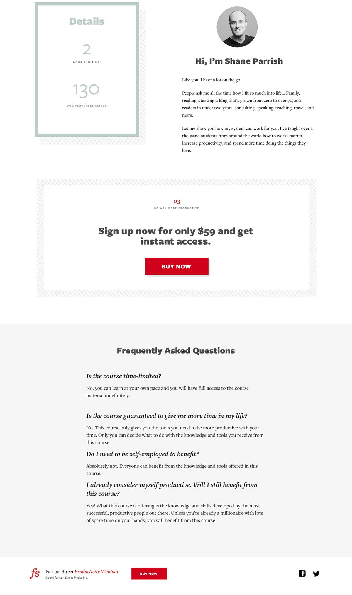
We wanted to add finishing touches to the design to create visual interest and reinforce the brand in subtle ways, which we did through the drop shadow. We applied the drop shadow to the pull-out modules, including those that housed a way to purchase the product, giving a custom touch that became a small but prominent element we used throughout the site to help define the brand look. The shadows are filled with a repeating pattern of diagonal lines—one of the small details that contributed to the overall brand look and feel for Farnam Street.

Real-Time Polishes
Another step we felt worked well on this project was having our Creative Director, Jeremy, code the HTML and CSS for the site himself. In our typical process, Jeremy will pair with a developer throughout a site build, but because of the simplicity of this site’s design, we tried this alternate approach. Having Jeremy build out the site allowed him to focus on completing the design in-browser without having the additional step of communicating the detailed, interactive polishes not represented in an early static design comp. Because the proportions, spacing, and polish were so core to the site experience, it was best that they be built in from the beginning. Not only did this help carry the design intent throughout the project, it meant Philip, one of our frontend designers/developers, could jump right into completing functional templates. And after some refactoring, we had a beautiful site built in just a short amount of time.
CSS Fine Details
Because the look of the site was very simple, we wanted to incorporate some animations and transitions to add personality and finish off the site with delightful detail. To achieve this, we had some fun with custom CSS drop shadows and viewport units.
The custom diagonal line drop shadows had Philip giddy from the start, to push CSS in an exciting way. The diagonal lines are actually a CSS linear-gradient background on an :after pseudo element. The placement of the drop shadow is done using position: absolute and viewport units on top, right, bottom, and left properties, so the shadow’s distance grows with the screen size.
The drop shadow isn’t the only place viewport units popped up. The textual content actually scales with the screen size. Media queries were used to essentially create a min-font-size and a max-font-size, and the text scales in size between those queries. This was a rather fun approach that is essentially a CSS-only version of Paravel’s FitText jQuery plugin.
The last bit of refinements came with the little bit of JavaScript the website uses: the scrolling fade-in animation and the Stripe integration. This is achieved by detecting an element’s position in the viewport and applying classes according to its state. Using these classes, CSS animations were applied to fade in the content. One of our favorite ways we incorporated this was adding a three-dimensional effect of the shadows to show them growing as the primary element moves up and to the left.
Optimizing for Performance
Performance is important at Sparkbox, but we knew that for Farnam Street, performance would be essential. We used a handful of tried and true methods to help in this area, starting with the basics.
Webpack has become our go-to tool for building, concatenating, and minifying javascript assets. In this case, we bring together our scroll fade-in refinements, a super-slim modernizr build, our Stripe Checkout implementation, and Sparkbox mediaCheck into a single Javascript asset. To attack one of our largest dependencies, jQuery, we created a custom build with only the features needed. Further, you can see in the page source that when IE9 or below is used, we load the larger jQuery 1.12 from Google’s CDN. Modern browsers receive our super-trim, custom 3.1 build for a 10KB savings (33.3KB vs 23.5KB respectively).
With the site in place and assets built for production, we measured performance using one of our favorite tools: WebPageTest. This led us to improve the cache headers on the servers. Updating our .htaccess file resulted in our speed index dropping from 2168 to 1397. Speed Index golf hole-in-one!
Trust-Based Collaboration
“Because we have a trust-based relationship, we were able to come up with something better than either of us could have created independently.” —Shane
We’re so pleased with the approach and collaboration of this Farnam Street redesign project. Much like the blog’s mission of self-improvement and learning, this was a learning exercise for us. We explored new elements and approaches to advance the Farnam Street brand and create a memorable experience for long-time readers.
“It’s beautiful! When you look at it, you just want to be immersed in it.” —Shane
