YouTube embeds track user data for advertising purposes. You can watch the video on YouTube if you prefer not to grant consent for YouTube embeds.
Throughout the video, I say Sass while referring to SCSS. I know there is a difference between Sass and SCSS but saying Sass rolls off the tongue better than spelling out S.C.S.S.
Video Transcript
I would like to talk for a little bit about CSS variables and one of the ways in which they’re different from SCSS variables. Now for the past few years, I have written most of my styles in SCSS and one of my favorite benefits of SCSS is the ability to use variables. So, when I first heard of the new CSS variables I was excited to have that functionality built into CSS. After playing around with them a bit, I wasn’t a fan of the double dashes in variable names. And then in order to use a variable, you have to wrap it in a var() function, which felt odd.
Since I was already able to use variables with SCSS, I pretty much ignored the CSS variables. It was when I needed to simplify a system of utility classes that I realized they are indeed different and they do have a unique benefit.
The Simple Spacing System
Let’s say we have a simple spacing system. We have seven classes that apply margin to various parts of an element. Each of these classes sets the margin to our spacing variable, which is 1rem.
$sp: 1rem;

.sp-all {
  margin: $sp;
}

.sp-top {
  margin-top: $sp;
}

.sp-bottom {
  margin-bottom: $sp;
}

.sp-left {
  margin-left: $sp;
}

.sp-right {
  margin-right: $sp;
}

.sp-vertical {
  @extend .sp-top;
  @extend .sp-bottom;
}

.sp-horizontal {
  @extend .sp-left;
  @extend .sp-right;
}
This system is going to work really well until we want to add different sizes of margin. In order to add these new sizes, we have to make our simple spacing system a bit more complex.
The Complex Spacing System
Here, we want to add two new margin sizes. We’ll start with our first set of classes and then for each new margin size we need to duplicate those classes. First for the small size and then for the large.
$sp: 1rem;
$sp-small: 0.25rem;
$sp-large: 2rem;

// Looks just like the first example
.sp-all {
  margin: $sp;
}

.sp-top {
  margin-top: $sp;
}

.sp-bottom {
  margin-bottom: $sp;
}

.sp-left {
  margin-left: $sp;
}

.sp-right {
  margin-right: $sp;
}

.sp-vertical {
  @extend .sp-top;
  @extend .sp-bottom;
}

.sp-horizontal {
  @extend .sp-left;
  @extend .sp-right;
}

// Now let's add add some modifier classes for our small and large sizes
.sp-all-small {
  margin: $sp-small;
}

.sp-top-small {
  margin-top: $sp-small;
}

.sp-bottom-small {
  margin-bottom: $sp-small;
}

.sp-left-small {
  margin-left: $sp-small;
}

.sp-right-small {
  margin-right: $sp-small;
}

.sp-vertical-small {
  @extend .sp-top-small;
  @extend .sp-bottom-small;
}

.sp-horizontal--small {
  @extend .sp-left-small;
  @extend .sp-right-small;
}

.sp-all-large {
  margin: $sp-large;
}

.sp-top-large {
  margin-top: $sp-large;
}

.sp-bottom-large {
  margin-bottom: $sp-large;
}

.sp-left-large {
  margin-left: $sp-large;
}

.sp-right-large {
  margin-right: $sp-large;
}

.sp-vertical-large {
  @extend .sp-top-large;
  @extend .sp-bottom-large;
}

.sp-horizontal-large {
  @extend .sp-left-large;
  @extend .sp-right-large;
}
We had to make 14 new classes to add just two new margin sizes. You can see how this could quickly get out of hand if we have a spacing system that requires a very large variety of margin sizes. We’ll end up with a very large list of classes, some of which might never get used. What used to be a simple spacing system has now grown and gotten out of hand. In order to simplify things, I played around with the code a bit and came up with my dream spacing system.
The Dream Spacing System
Once again, we start with our seven initial classes, but if we look at the bottom we have two new modifier classes. I really wanted the ability to take our spacing variable and update it with a new value and then have that class work alongside the first set of classes.
$sp: 1rem;
$sp-small: 0.25rem;
$sp-large: 2rem;

// Looks just like the first example
.sp-all {
  margin: $sp;
}

.sp-top {
  margin-top: $sp;
}

.sp-bottom {
  margin-bottom: $sp;
}

.sp-left {
  margin-left: $sp;
}

.sp-right {
  margin-right: $sp;
}

.sp-vertical {
  @extend .sp-top;
  @extend .sp-bottom;
}

.sp-horizontal {
  @extend .sp-left;
  @extend .sp-right;
}

// Modifier classes
.sp--small {
  $sp: $sp-small;
}

.sp--large {
  $sp: $sp-large;
}
If we look at the div example in the HTML, we already have our .sp-all class. This is adding 1rem of margin on all sides of the div. Ideally, we could add the modifier class .sp--large to that same div and the margin would be updated to 2rem.
<div class="sp-all sp--large">Biscuit cupcake jelly chupa chups soufflé. Wafer tart fruitcake marshmallow caramels candy. Dragée muffin soufflé marshmallow sesame snaps cheesecake. Jujubes pastry ice cream. Sesame snaps halvah cheesecake toffee marshmallow carrot cake. Cake halvah biscuit wafer pudding sugar plum jelly. Cake jelly-o chupa chups brownie topping cake gummi bears pastry.</div>
Unfortunately, this doesn’t work. At the end of the day, our SCSS has to compile down into vanilla CSS in order to be usable. And when we compile the code in our dream system, we lose those modifier classes completely.
.sp-all {
  margin: 1rem;
}

.sp-top, .sp-vertical {
  margin-top: 1rem;
}

.sp-bottom, .sp-vertical {
  margin-bottom: 1rem;
}

.sp-left, .sp-horizontal {
  margin-left: 1rem;
}

.sp-right, .sp-horizontal {
  margin-right: 1rem;
}
Since we were only reassigning the variable but not actually using them, our classes are empty, and when we compiled the code, SCSS just wiped them away. In order to use our updated variable, we would have had to add seven new classes for each size and use the reassigned variable, and we would have ended up with the same complex spacing system we were trying to simplify.
The Manageable Spacing System
At this point, I started searching for a way to build this dream spacing system and I realized I could do this with CSS variables.
:root {
  --sp: 1rem;
  --sp-small: 0.25rem;
  --sp-large: 2rem;
}

// Looks just like the first example
.sp-all {
  margin: var(--sp);
}

.sp-top {
  margin-top: var(--sp);
}

.sp-bottom {
  margin-bottom: var(--sp);
}

.sp-left {
  margin-left: var(--sp);
}

.sp-right {
  margin-right: var(--sp);
}

.sp-vertical {
  @extend .sp-top;
  @extend .sp-bottom;
}

.sp-horizontal {
  @extend .sp-left;
  @extend .sp-right;
}

// Modifier Classes
.sp--small {
  --sp: var(--sp-small);
}

.sp--large {
  --sp: var(--sp-large);
}
Here, we have our dream spacing system but instead of using SCSS variables, we are using CSS variables. If we compile this code, we actually get to keep these classes because this is already vanilla CSS. Now if we try to apply our modifier class, the element actually updates.
See the Pen Manageable Spacing System by Kasey Bonifacio (@kaseybon) on CodePen.
Being able to update these variables within classes has allowed us to simplify our complex spacing system. Instead of having 21 classes to represent the three margin sizes, we have condensed them down to just nine classes.
Browser Support

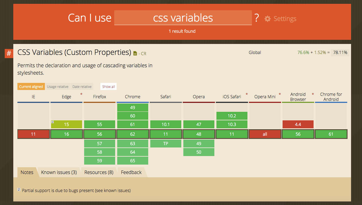
Browser support for CSS variables is pretty good. IE11 and older, however, are an issue. There are polyfills available but unfortunately, all of the ones I found were only able to mimic the functionality SCSS variables and we lost the ability to update and scope a variable.
So, checkout the article that goes with this video for links to some of those polyfills as well as an idea for a SCSS mixin you can use that generates fallback classes for old IE.
There will also be resource links throughout the text, including a CodePen collection where I built a series of manageable utility systems that will hopefully give you some ideas to start playing around with CSS variables.
Looking for some other ways to keep your CSS manageable?
Sparkbox’s Development Capabilities Assessment
Struggle to deliver quality software sustainably for the business? Give your development organization research-backed direction on improving practices. Simply answer a few questions to generate a customized, confidential report addressing your challenges.

