
Ohio native Scott Hurff posted a critical review of Facebook’s Paper iOS app. Scott’s concern is not about the concept itself, but instead the Thumbnastics Paper’s navigation forces on its users.
Navigation can be especially challenging and time-consuming in a responsive world. Recognizing troublesome scenarios early and making adjustments is essential, which is why we’re so intrigued by Scott’s use of the Thumb Zone to quickly analyze and describe Paper’s shortcomings.
Thumbnastics
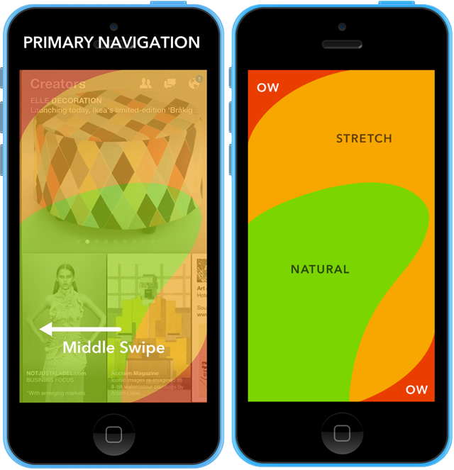
Using Scott’s Thumb Zone overlay, you can see that Paper’s primary content interaction, a swipe, asks the user to “hook” into a stretch zone. Social interactions appear at the far edge of the stretch zone.
Navigation and social interactions are critical components of user engagement, but Paper makes this incredibly awkward as the Thumb Zone visual makes extremely apparent. We would much rather see primary targets for navigation and engagement within the Natural Zone.
This Thumb Zone overlay is such a simple and easily reproducible exercise that we can apply to all our active and future projects. Let’s take it out for a spin on some popular mobile sites…
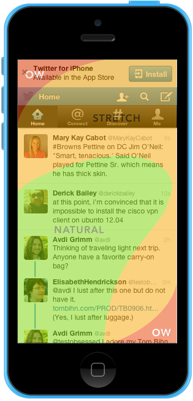
Consuming tweets is obviously an important part of the Twitter experience, but writing your own tweets is also important. Composing a tweet requires using a button way up in the stretch zone. And take a look at that native app call to action—that’s a lot to ask of a user standing in line at the grocery.
NBC
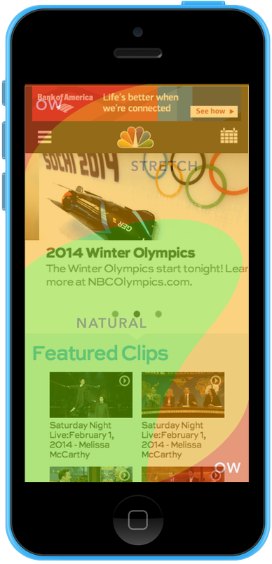
On the recently redesigned mobile NBC website, ads and a hamburger navigation button occur in the OW Zone. Might they be better off with an off-canvas navigation with a swipe-in motion?
Sparkbox
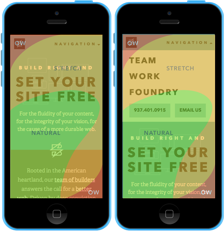
Here at Sparkbox we recently delivered the new sparkbox.com. Already aware that mobile users find it a challenge to discover navigation, we used the full word “Navigation” rather than the infamous hamburger icon. Still, it clearly remains in a stretch zone. On the right, you see that once opened, our destinations are much closer to the comfortable zones.
We’re tracking custom metrics to see how all this works out for engagement and bounce rates.
Navigation of the Future
As the Sparkbox team contemplates Scott’s review, our own metrics, and the results of a Lenovo Responsive Enablement usability study, it’s apparent navigation across devices still needs a lot of love and attention. Experimenting within our frontend process to account for this challenge is a major focus for us this year.
We’ll continue sharing our thoughts, findings, and experiments on these patterns and more here in The Foundry.
