Ohio Certified Sites was featured on the RWD Podcast with Ethan Marcotte and Karen McGrane.
The Dayton Power & Light (DP&L) Ohio Certified Sites website is a perfect example of what a strong, collaborative working relationship can produce. We’ve worked with DP&L for many years on numerous projects and have gained a solid understanding of both their industry and business. Our teams know each other well, know how we work, and trust each other to deliver, making re-engagements on new projects feel like a welcomed reunion. Our shared trust and knowledge allowed us to really push the creative boundaries on Ohio Certified Sites—making it better than it ever could have been without all the previous investments.
Background
DP&L is the local regulated electric utility in Dayton. They distribute electricity to most of the homes of our Sparkboxers and other families throughout West Central Ohio. The first site we launched for DP&L is now almost seven years old. Between its parent, holding company and subsidiaries, we’ve launched at least another dozen sites and web applications since that first site. Through maintaining, enhancing, and creating DP&L web properties, we work with them often and know both the marketing and IT arms of DP&L well. A few months ago, DP&L told us they needed a new site that focused on attracting businesses to build within the DP&L service territory. We were excited not only to work with our friends again, but also to be on a project that would benefit our local economy.
The first site we launched for DP&L is now almost seven years old. Between its parent, holding company and subsidiaries, we’ve launched at least another dozen sites and web applications since that first site.
At its core, DP&L exists to bring safe, reliable electricity to homes and businesses. So DP&L, like most utilities, tends to make safe, conservative choices (even on the Web). Of course they care about their customers and want to make clean and highly usable experiences to aid customers in their busy lives, but the flash and sizzle of a company focused on sales isn’t really their thing. So the primary goal to attract industrial businesses from all over the world to relocate to West Central Ohio through—what we would call—a progressive promotional site like OhioCertifiedSites.com put them in unfamiliar territory. While we were excited to explore how to best achieve the goals of this project with them, we also knew those goals would push their traditionally conservative boundaries.
Content Planning and a Prioritized Navigation
This project benefited from having a dedicated copywriter who worked alongside our team from the beginning. She focused on producing SEO-rich content, and our UX Director, Drew, did an awesome job taking the copy she wrote and working it into the site wireframes to imagine how to best present that on the web. Having real content to work with is rare and extremely valuable. We all knew the individual sites were the stars of the website. They were the reason it would exist. So we wanted to make sure they appealed to a variety of audiences (whether it’s the site “researcher” crunching numbers or the CEO picturing a business and employees living in West Central Ohio).
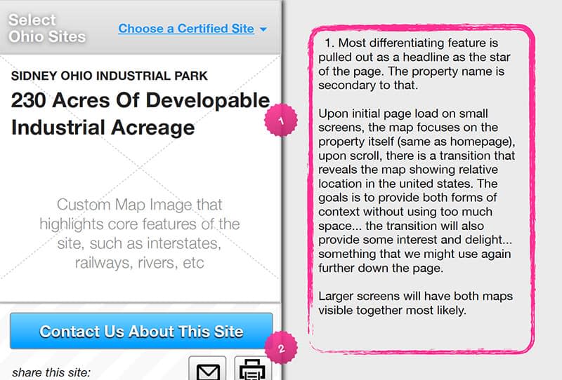
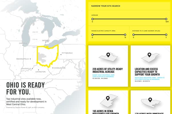
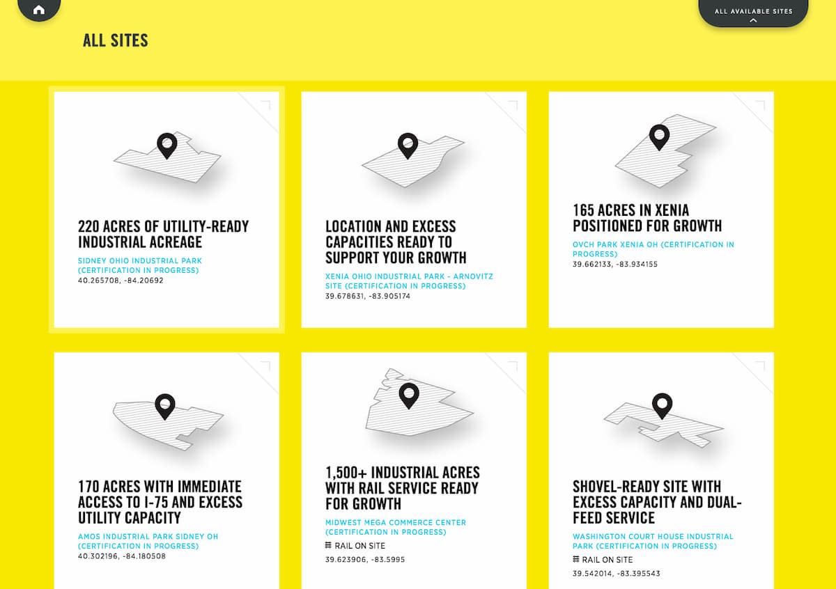
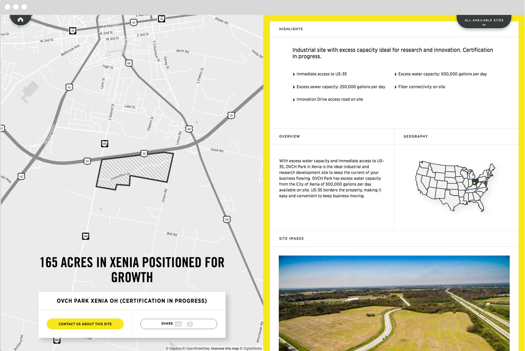
Drew took an approach to focus on the primary user, the “researcher,” while still being attractive to the larger audiences. He pushed page titles that were descriptive of the sites, not just ambiguous names (i.e. “230 acres of utility-ready industrial acreage” versus “Sidney Ohio Industrial Park”).
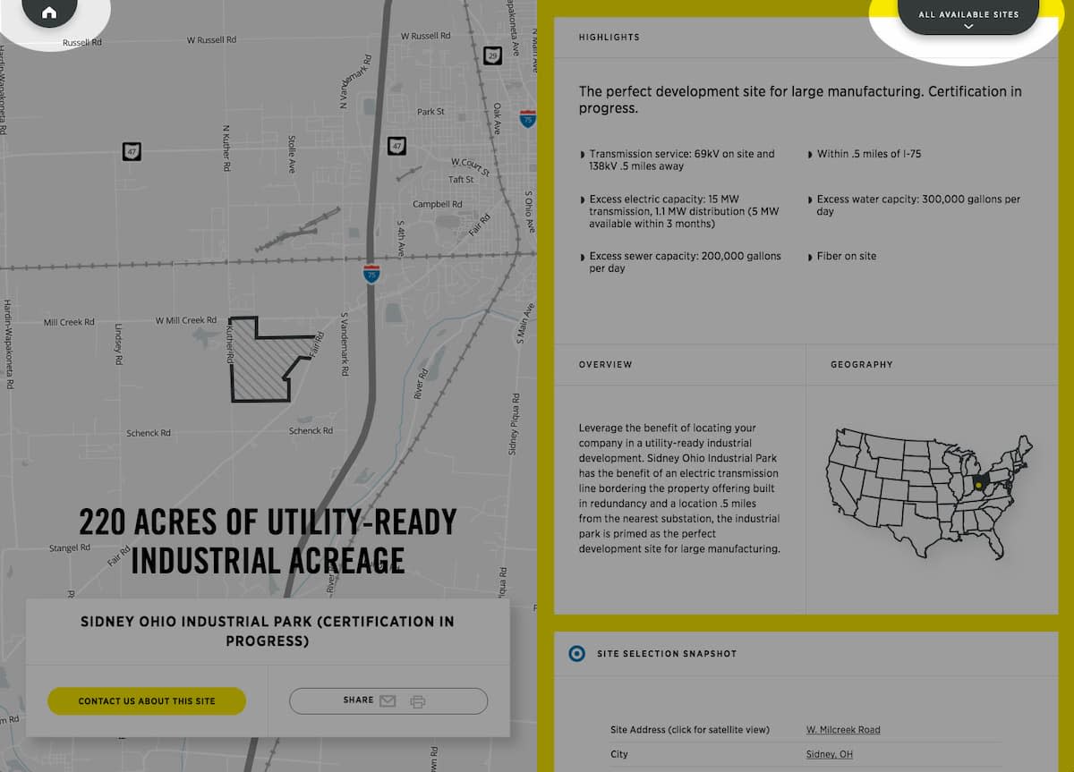
We knew that if a site met utility and other needs, the next big concern for a business interested in the location was knowing that working with local governments and utilities would be easy, smooth, and friendly. Drew recommended we start the page with descriptive information, pull out bullet points of key highlights, and then break up the data with quotes. To make the offline buying experience easy, we made all the data available nicely in both Excel format and a PDF brochure.
If you can get your goals right, then only putting content that supports critical goals in the header can significantly help users get to what they actually want.
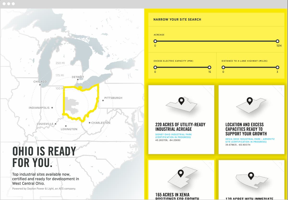
Goals are a project manager’s best friend, or at least a content strategist/project manager’s best friend. I get a little ridiculously excited about understanding project goals and priorities. Prioritizing content on individual pages has been a constant in our projects—especially once responsive entered the scene—and we started taking that same thinking into navigation planning a few years ago with priority plus navigations. Lately, I’ve been inclined to take that thinking a step further and seriously prioritize navigations and strip away everything that doesn’t support a critical goal from header navigation. I firmly believe the biggest thing that keeps users from finding the information they want is bloated sites with more pages than necessary. If you can get your goals right, then only putting content that supports critical goals in the header can significantly help users get to what they actually want. DP&L had a clear, shining, top goal to sell locations, so all the individual site locations wound up being the header navigation. After that, all the supporting content that helped lower priority goals found a home in the footer.
We had a lot of ideas around additional content that could have appeared on the site, but when we seriously questioned that content as a team, DP&L and we both knew those additional content items weren’t strongly tied to the purpose of the site, and they were thrown out of contention.
Design
DP&L told us they needed this site to be memorable—to truly be special and stand out from the countless other sites showcasing developable land—and Jeremy, our Creative Director, intended to deliver with his design. Our team talked a lot about the design before showing it to the client.
...we wanted to meet their goals, not give them something they’d be comfortable with...
We felt confident we knew what was needed to meet their goals, but we also knew the DP&L team well—and we knew the progressive design would be a shock to them since it was so different from the conservative designs they were used to and probably expecting. But we wanted to meet their goals, not give them something they’d be comfortable with. Even with the great trust we had in our partnership, we knew there would be a lot of discussion needed to show them why we were confident in this design.
Jeremy and I got the chance to work with Dan Mall on a project last year and loved seeing how he worked with clients and talked with him about his approach both within and outside that project. Prototyping is something Dan does that felt perfect for this project. When creating any kind of prototype, there’s always this balancing act of spending just the right amount of time on the prototype to get approvals, but not finessing that prototype too much and cutting into the time you spend on the final “thing.”
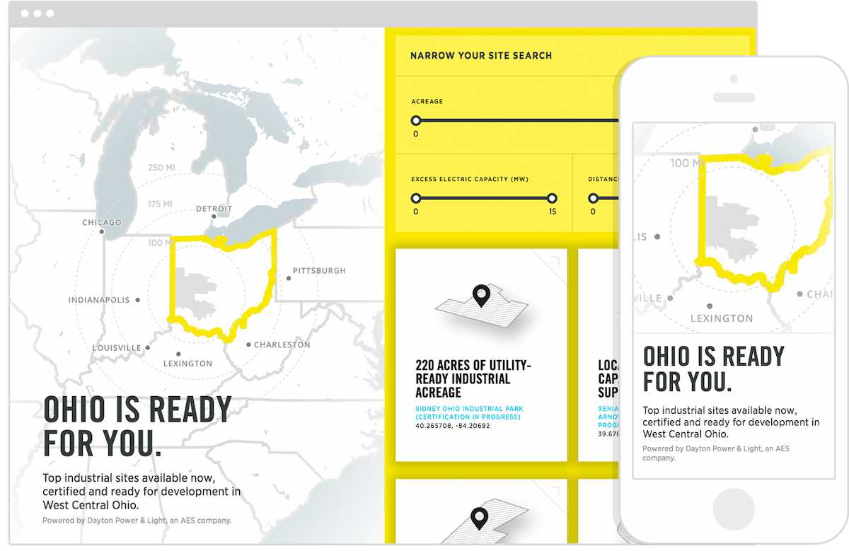
So Jeremy focused in on the one aspect of his design that would be hardest to show in a static design (the idea that on larger screens, the left half of the screen would not scroll while the right side would). And he turned to CodePen to quickly create his prototypes (homepage design scrolling prototype / location page design scrolling prototype). Jeremy also took the time to find examples of some great zooming animations from Mapbox to enhance his presentation to the client.
We’ve shied away from really “presenting” our design in the past. Knowing how much we wanted to push what the client was likely picturing on this project, we took a very different approach, and it definitely paid off. A more relaxed, “here’s the design” meeting without a “here’s why this is the right design” presentation would have rendered this solution dead on arrival. Instead, we were able to help our client understand why this was the right design to meet DP&L’s goals for the site.
Development
In order to turn those stellar designs and animations into code, Adam, Daniel, and Ryan knew we wanted to continue to push our React chops and use the platform to make some memorable page transition animations. And—aside from custom applications—every other project we’ve done for DP&L’s teams has been built on ExpressionEngine (EE), so we needed to make this work on top of EE to keep things consistent for their team. Again, thanks to the trust DP&L had in us to do what’s right technically, they were on board with the plan.
EE Setup
The first hurdle was to turn EE into a JSON API. EE is not the most ideal content management system when you’re looking to create and serve an API, but we’ve successfully made it work before on pieces of projects, like the photographer search on Wonderful Machine. This time, we needed to turn every bit of information coming out of EE—every field—into content consumable by the API. We created an API.group to house our various API templates and an EE.group to house the few EE templates we had.
We used the HTTP header plugin in our API.group templates to serve up our JSON with appropriate headers. Some of our API templates were as simple as this:
site-data in the snippet is a JSON template with EE tags for just about every value. It can be frustrating to “hand-craft” an API response. To ease that frustration and prevent errors, we used https://jsonlint.com to validate our JSON as we developed the API.
We also used a plugin called Mo-Variables to expose GET variables to our templates. This lets us use GET variables in our templates like this:
An example variable in a template
At the end of the day, we had our JSON and templates, but load times were taking way too long. By default, ExpressionEngine has template caching that you can utilize through a really simple dropdown from “No” to “Yes.” Yeah, it was that easy. However, this only shaves off a minimal amount of load time when you are creating JSON from a lot of queries. In order to really get our pages moving down the internet tubes, we utilized the obscure but oh so helpful cache=“yes” refresh=“1000” to every single channel tag. This nifty addition to your exp:channel tags will explicitly cache the underlying SQL query (where the data is stored) for n amount of seconds specified by the refresh parameter. These two little additions got our ExpressionEngine templates served up super fast and primed for the fun to come!
Since we had the constraint of using ExpressionEngine, we weren’t able to leverage React on the server, but that didn’t stop us from creating a great experience with and without Javascript. We created EE templates (often as easy as copying the rendered React component and then adding the right EE tags) that we included in <noscript> tags to serve up the same content to users without Javascript.
React Setup
Then came the fun stuff. The site needed to pop and leave a lasting impression. It was a perfect opportunity to pull out some React (something we’ve grown fond of doing) that perfectly aligned with the project goals. We were already fans of Webpack, so we used that and a few npm scripts to build our project. We also used React-router to handle the transitions between pages using client-side routing. This lets users navigate around the site without having to see a page refresh and let us sprinkle some cool animations on each transition.
One of the many benefits of React is its filesize. In production using gzip and minification, we were able to squeeze our JS payload (not counting mapbox) down to ~80kb! We also took advantage of React’s lifecycle hooks to prevent unnecessary browser rendering, which improved the actual Javascript performance on the site.
Thoughtful, Solid Solutions
We’re always excited to rise to a web challenge. Creating thoughtful, solid solutions for clients is why we’re here. Working with the same client repeatedly allows us to deeply understand internal needs and continually hone in on how to best meet short- and long-term goals.
Creating thoughtful, solid solutions for clients is why we’re here.
For clients, it’s all the benefits of an internal team without the overhead. For us, it’s a chance to take all that we learn on a myriad of projects and channel it into subject matter we know forwards and backwards. We’re excited to see Ohio Certified Sites go live and add another great project on our growing list with DP&L.
