Here at Sparkbox, we understand that accessibility is valuable to any engagement. The web is the future, and it should be available to any person regardless of device model or operating system, location, physical or mental impairment, bandwidth, data connection, or general ability to access the web. One way to try to achieve a more accessible site is to focus on simplicity. After all, a simple, well-marked-up page with no special CSS is wonderfully accessible, but it lacks aesthetics. There is tension between accessibility and design that can’t always easily be balanced. This is how we worked to achieve a beautifully accessible design with Specific Clarity.
Solidly Accessible Design
Darren Kall, managing director of Specific Clarity, spends his time researching, designing, and evaluating user experience. (If the name sounds familiar, it may be because Darren was one of our Maker Series speakers this year.) As someone who has spent his career pioneering accessibility and UX, Darren is especially sensitive to all user needs—and has run accessibility teams for AT&T Bell Laboratories and Microsoft. It should come as no surprise that he wanted to include good accessibility practices in the site Sparkbox built for his company. In addition to being accessible, Darren and his team wanted the site to feel inviting while portraying themselves as impactful, rigorous experts who aren’t hip and trendy (nor boring!).
The site had to have a great user experience and be simple to use, but there were a lot of other needs on which it had to deliver. We experimented with using photography to help deliver Specific Clarity’s message, but it didn’t feel right and came off as distracting from the content. Marshall suggested using some simple line-art illustrations, and everything started to click. An accessibility bonus of the illustrated images was we would be able to easily adjust the color and contrast of these images to suit the content without losing any visual detail, thus keeping the page interesting but never illegible.
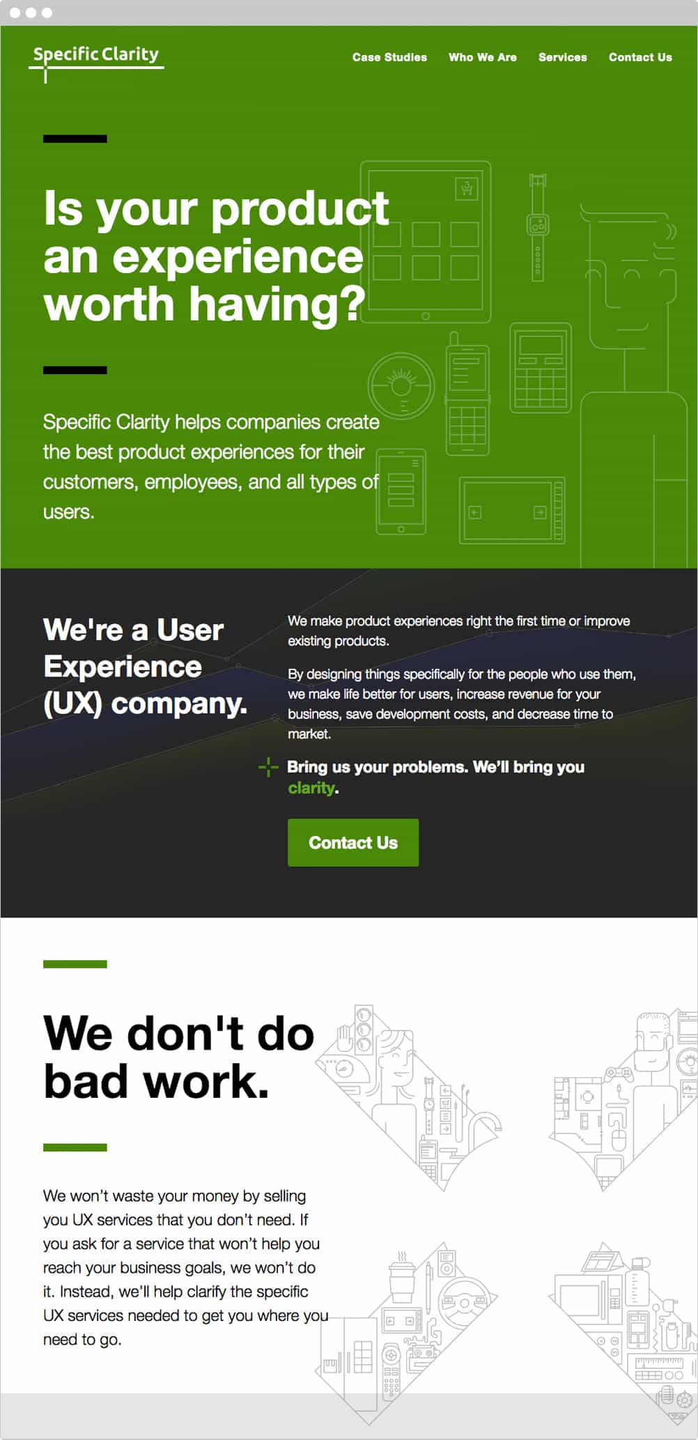
With the amount of textual content, illustrations, and a limited color palette (green, grey, white, and black), the Specific Clarity site presented an interesting challenge: creating visual hierarchy on the page.
To accomplish hierarchy, we experimented with text size and weight between each large chunk of content. We chose a simple, non-distracting, no-nonsense font for all text: Helvetica. It’s accessible, it works on all browsers, and it’s pretty. We used large, single-color backgrounds to group text together, showing hierarchy within blocked sections of different background colors.
We also felt it was important to display all content by default—nothing hidden. With the exception of the menu at small screens, that meant no carousels, accordions, or collapsable containers. Our goal was to make the content readable, but these types of elements make a site significantly harder to use for users with and without unique accessibility needs. While we could have used ARIA attributes to remain accessible, it is preferable to keep the site simple for all users, unless a strong need arises.
Testing
To stay true to our accessible goals, every so often during development, Darren would run the site through an accessibility checker called WAVE. If he found any issues, errors, or the like, a Slack message went to our team, highlighting the problem and asking us how we could improve the website. We were so lucky with Darren as a client, since he already knew that little things like contrast values of type were extremely important to creating an accessible site. Those with visual impairments (such as colorblindness or just old age) have a more difficult time reading poorly contrasted text.
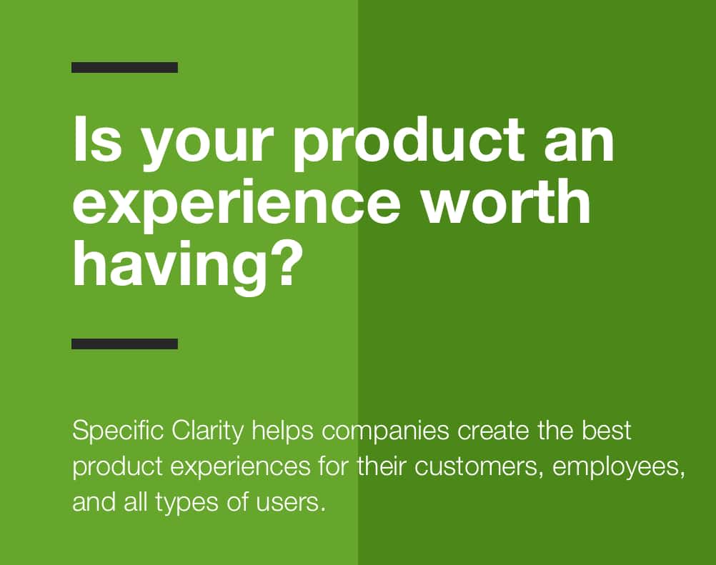
One issue Darren pointed out, and we agreed, was the contrast wasn’t awesome between our mid-saturated green background and the white/black text we had sitting on it. We experimented with the primary green of the site: finding something that still had quality visual impact without reducing readability. We landed on a slightly more saturated, slightly bluer green. This new green improved contrast standards with both our dark grey and white text colors.
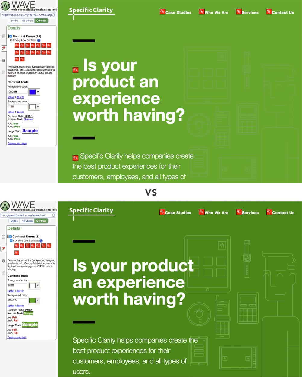
As you can tell, we aren’t meeting the highest contrast ratios everywhere, even with the color change. The homepage, for example, still has 8 contrast errors, revolving largely around a few areas with smaller text on the page and the nav bar. However, the new green cut the original errors in half. This is one space where our teams opted to meet most accessibility levels but allowed some areas to be less than the highest requirements to maintain a pleasing design that was still highly accessible.
We were able to bubble up concerns like this early because we strive to get to a testing environment early to not only tell clients the progress we’ve made, but actually show them the reality of where the project stands early and often. And we test, not only for contrast ratios, but also browser and device testing to make our content appropriately accessible. While there are several nuances to how different a design can appear in different browsers and devices, being able to access content is a constant expectation for which we test.
Our quality assurance testing mainly revolved around browsers and devices, and one area we could have spent more time on is testing a variety of assistive devices—screen readers or computer narrators, high contrast, large-type devices, and/or voice-recognition software. We also could have had someone with a visual, cognitive, and/or physical impairment do a UX test. These practices elevate the quality of accessible websites. In this one instance, our accessibility tension was less around design and more around timeline and budget, and this is an area that both teams could look to incorporate into future improvements.
Design for Everyone Working with Specific Clarity was a reaffirmation of how websites can prioritize accessibility even with limited resources. Choosing a clean design does not mean the site has to be aesthetically unappealing, but it does make content more accessible for all users—not only those with special needs.
Our designs should consider contrast and visual clarity from the very start. Tools like WAVE, axe, Check my colours, and Luminosity exist to identify missing or errant accessibility traits with the click of a button. Following accessibility standards is too simple to claim laziness or lack of time.
We should all fold accessibility into every aspect of the sites we build, even the design. Don’t let it be an afterthought; find ways to make it an everyday thing. If we can make accessibility as important as we make things like CSS naming conventions or browser testing, we will be making the web a better experience for many people.
Content should not be out-of-reach for any user. A web built right means a web built for everyone.
WCAG 2.1 Study Guide
THIRTEEN GUIDELINES FOR IMPROVED COMPLIANCE
POUR concepts ensure that your content is perceivable, operable, understandable, and robust. Sparkbox developer Kasey Bonifacio offers clear and simple criteria to make sure you’re up to speed.
