In our ever-evolving design and development process for responsive websites, we’ve explored several methods and deliverables. Currently, at Sparkbox we involve two unique deliverables that are created concurrently. The content prototype and style prototype are produced without dependencies on one another—yet are created through the collaboration of content, design, and code contributors alike.
We invite you to pick over these progressing prototypes for the Sparkbox site rebuild and read below for more about them.
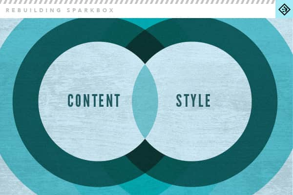
About the Content Prototype
From Drew Clemens:
Both Ben and I have written about prototyping with real content. It’s an exercise that we love, but it can be a challenge to implement. On client projects, you may not have the luxury of final content when you need to begin design or development. However, I believe that one should make every effort to create a content prototype of some kind, even if the content isn’t totally complete. Even real-ish content prototyping can have major positive impacts on design and functionality decisions.
In the development of the new Sparkbox site rebuild, we had no excuse not to build a complete content prototype. Still in development, our content prototype uses as few styles as possible and seeks to focus almost completely on the language and structure of each major content chunk, not to mention the overall site architecture.
I won’t elaborate much more, given that the content prototype is designed to speak for itself. However, I will say that it intends to achieve some of our evolving brand language goals while remaining succinct and usable.
About the Style Prototype
From Jeremy Loyd:
In our design process, the style prototype establishes basic visual styles to be applied to content of a site. This can include typography, color, navigation, buttons, photography style, etc. Also, read more about the style prototype.
Photoshop Experiments
We began the redesign of the new Sparkbox site just as we were making the transition to using style prototypes as a major design deliverable. For this reason, the style prototype developed for the new site has been heavily influenced by previously created Photoshop experiments and layouts.
In these Photoshop experiments, we arrived at a layout that used large areas of fluid-width color fields that contained text and images. Most of the time, the headline text and images are centered within the containing shape. The color fields always spanned the full-width of the site which creates a full browser screen experience no matter the browser width. The result is a site that is very grid-like. Some of the color fields always span full-width, sometimes stacking vertically next to others. This treatment is reflected in the content blocks in the style prototype.
Color and Texture
We established a color palette for the Sparkbox brand previously, modifying our original teal color to more of a cyan. For the website, the choice was made to keep the colors very limited so that work and images would stand out that much more. We arrived at using black and variations of the new Sparkbox blue. We also have an orange swatch in our back pocket for accent.
Our current site and previous identity used some tasteful bits of texture here and there. For the new site, we’ve made a strategic decision to stay away from texture almost entirely. We did this for a couple of reasons. First, we knew that performance was a major goal of ours, so we wanted to limit the number of images used. Secondly, after arriving at a layout of large, flat color fields sans-texture, we couldn’t help but think how beautiful and crisp the site would look—especially on high-density displays.
Assets
Buttons on the redesigned site will be simple, possibly carrying icons next to the button text in some cases. Hovers will be understated but exist to give some additional interaction.
As for images and illustrations, we plan on centering them in the color fields and leaving generous “white” space around them. In some cases, the images will contain a title above or text below. This text will usually be centered. The only images that will appear in full color will be our work; other images and illustrations will carry the limited color palette of blues, black, and grays.
Overall, the constant, full-width layout presents definite visual challenges when it comes to how the site responds. We feel confident, though, that we can work out much of this in the browser, and we think it lends itself to an interesting, memorable layout.
