
With how much accessibility knowledge there is floating around the internet, it’s still easy to feel a lack of guidance. It’s hard to keep track of it all. Before I became familiar with WCAG, I’d find myself doing things “for better accessibility” solely based on tips and hearsay from blog posts and colleagues. I knew a decent number of best practices, but I wanted something more comprehensive. People kept handing me fish, but I wanted to know how to fish.
I didn’t have confidence in my accessibility skills. How could I be confident in my accessibility know-how if I couldn’t even evaluate my own work? I needed clear-cut rules, something to test against and see if I was on the right track. If you can relate, I’ve got some good news: That rulebook exists! It’s called WCAG.
Meet WCAG
Web Content Accessibility Guidelines (WCAG) is an online standard that describes how to make accessible websites. Here’s a link to WCAG 2.0. Go read it, then come back to this post when you’re done.
Go ahead. I’ll wait.
All done? Did you read the whole thing? No, you probably didn’t, because you’re not a robot. WCAG 2.0 is a really technical document. It’s a standard. And it’s long. You’re not supposed to just sit down and read it. I wouldn’t recommend it, at least.
WCAG isn’t terribly approachable as reading material, but it’s extremely valuable as reference material. It provides clearly defined rules about how to make interfaces accessible. It’s the rulebook I’ve been wanting this whole time! Let’s talk about what is in this standard and how we can use it in our day-to-day lives.
What’s in WCAG?
While I don’t recommend reading all the way through WCAG 2.0, I do recommend reading its table of contents. Study it for a bit until you get a feel for what’s in the document, its scope, and how it’s structured. Poke around for a few minutes; don’t let yourself get overwhelmed.
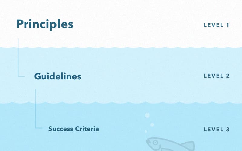
The top level of WCAG 2.0 consists of principles. Each principle contains one or more guidelines. If you drill into a single guideline, you’ll see that it contains one or more success criteria. Let’s talk about each of those levels.
Principles
The four principles of WCAG 2.0 are perceivable, operable, understandable, and robust. These are the top-level categories that every guideline fits into.
Guidelines are good but the reason for the guidelines is more important. Understanding the principles behind why guidelines exist can help us build interfaces that are not just technically accessible but also, more importantly, usable. An excellent read that goes more in-depth on this subject is the article “Constructing a POUR Website” on WebAIM. These four principles might feel unnecessary, but they serve as an important reminder that we’re building for people. That’s why we need guidelines in the first place.
Guidelines
Making a website accessible can be intimidating. Simply aiming to make a website perceivable, operable, understandable, and robust is too general. How are you supposed to consider the infinite combinations of abilities your users may or may not have? That’s exhausting. Not to mention impossible.
Now count WCAG’s guidelines. There’s 12. Just 12! That’s a lot less than infinity. Plus, there are a few that are often not relevant. I’m looking at you, Guideline 2.2. Whenever I’m feeling overwhelmed by the huge number of possible use cases, I stop, breathe, and look over this short list of guidelines. It really does help.
Some guidelines make plenty of sense without context, such as Guideline 2.1: Make all functionality available from a keyboard. Some don’t make sense out of context, like Guideline 1.3: Create content that can be presented in different ways (for example simpler layout) without losing information or structure. Either way, each guideline is made up of rules called success criteria that clearly describe what they mean. Don’t be afraid to dig in when you need clarity.
Success Criteria
Success criteria are the meat of WCAG. They’re my favorite. While guidelines describe what to do, success criteria describe exactly what that means from a technical viewpoint. Guideline 1.4 is: Make it easier for users to see and hear content including separating foreground from background. Okay, yeah, that’s good to keep in mind, but what exactly does that mean? How can I make it easier for users to see and hear content? The success criteria of Guideline 1.4 answer this question by providing:
Rules about showing information through color
Minimum contrast requirements for text
Rules about providing volume control for audio
Rules about text resizability
And a few other relevant rules
If you’re feeling foggy about what guidelines are saying, success criteria get nitty gritty about how to align with them. Success criteria are designed to be testable. They’re the concrete bits of information that can tell you what you’re doing right and where you can improve.
Conformance Levels
Not all success criteria are created equally. Every success criterion belongs to a conformance level of A, AA, or AAA. Conformance levels indicate the ratio of value to effort. Let me explain:
Level A success criteria are the most foundational and typically the easiest criteria to implement. They are also the most essential, meaning that if they aren’t met, information can be completely locked away from people using assistive technology. For example, making all functionality of your content operable through a keyboard (Success Criterion 2.1.1) belongs to Level A because it is so significant for keyboard-only users. If your content isn’t accessible with only a keyboard, your content isn’t accessible to these users at all.
Level AA success criteria are a nice middle ground. They give you a fair amount of freedom when it comes to design, while still providing lots of value for everyone. For example, to achieve Level AA accessibility compliance, display text with a minimum contrast ratio of 4.5:1 (Success Criterion 1.4.3). This places some restrictions on what you can do with design, but it can improve the experience for anybody: whether that’s somebody with cataracts, or somebody using their phone outside on a sunny day. Level AA is an excellent baseline if you don’t know where to start, as it will likely become the standard for public accommodations websites.
Level AAA success criteria are hardcore. If you are Level AAA compliant, you’re an accessibility champion. These success criteria provide value and exist for a reason, but they tend to be more difficult to implement. For example, you can only meet Level AAA compliance if you provide sign language interpretation for audio content (Success Criterion 1.2.6). Level AAA isn’t recommended as a general policy since it isn’t always possible to meet all success criteria with some types of content.
To be compliant to a given conformance level, you must meet all the success criteria of that level, plus all levels below it. For example, being “Level AA compliant” means that all Level AA and Level A success criteria are met.
Supporting Documents
Success criteria are nice and concise but that means they sometimes leave you wanting more context. For example, success criterion 1.3.1 is a bit vague and difficult to understand:
1.3.1 Info and Relationships: Information, structure, and relationships conveyed through presentation can be programmatically determined or are available in text.
This is murky, and I wouldn’t know how to put it into action. Fortunately, each success criterion has an accompanying link about understanding that criterion. These pages describe the intent behind the success criterion, give real-life examples, and link to related resources. Here’s the Understanding 1.3.1 page if you’re curious about what success criterion 1.3.1 is talking about. I highly recommend you visit these pages any time you have questions about a given success criterion.
Putting It into Practice
Now that we’re familiar with the contents of WCAG, let’s talk about how to use this thing in real life.
Use It as a Reference When You’re Building Stuff
It’s so much easier to build something right the first time rather than coming back to fix it later.
If you design, reference WCAG while you design. You’ll have a much better end product if you consider accessibility from the get-go, rather than shoehorning it in at the last second. Consider how your designs will translate into native HTML elements to get that sweet, sweet baked-in accessibility. You can read more on designing with accessibility in mind here.
If you develop, reference WCAG while you develop. Any time a little voice pipes up in your head to ask, “Is this accessible?” pop open WCAG to answer that question. Catching this stuff earlier rather than later can help prevent costly rewrites after your codebase has grown.
Use It to Perform Audits
As much as we might consider accessibility when we’re building, some things can still slip through the cracks. Choosing appropriate heading levels is one of these accessibility practices that often gets neglected. When coding, we have to guess what the most appropriate heading level is when we’re building a module. The correct answer isn’t revealed to us until a webpage is fully assembled. Sometimes you can’t build accessibly on the first pass. This is when an accessibility audit can come in handy.
An accessibility audit involves looking at all the user-facing parts of your website and hunting for potential accessibility issues. After all potential issues are found and logged, suggestions are given to improve the website. This can be done casually, or it can be done in a more formal, legally compliant kind of way. Either way, an audit can be stronger and more useful by backing it with WCAG. WCAG can be thought of as a comprehensive checklist to make sure all your bases are covered.
Refer to It Whenever You’re Making Accessibility Suggestions
If you have a code review workflow in place, WCAG is a really handy reference. As a code reviewer, when you spot a potential accessibility issue, don’t just make a suggestion of what the reviewee should do. Instead, make a suggestion and link them to the relevant success criteria. This provides a ton of context for the reviewee, and encourages them to do some exploration on their own. You’re not handing them a fish; you’re handing them a fishing rod with detailed instructions on how to catch a fish.
Use It, But Use It Carefully
It’s possible to follow all of WCAG’s suggestions and still provide bad UX to people who use assistive technologies.
WCAG is excellent as a reference and as a standard. It gives us confidence that we’re on the right track, and empowers us to build accessibly. What WCAG cannot do is think critically for us. Mindlessly following success criteria might even lead us to build in a way that negatively affects the users who are counting on us. Build with empathy for the humans on the other end of the computer.
Caring about rules is great. Caring about the people they’re created for is better.
