Naming CSS stuff is really hard is a phrase that finds its way into conversations with frontend developers and designers more often than we would like. Organizing CSS becomes more complicated when Sass is introduced, partially because of the tricky little magic of variables.
Variables in Sass promote cleaner code, make quick changes easier, and even let you get a little mathy. My favorite way to use Sass variables is in a base style color variable Sass partial, typically named something super clever like color-variables.scss. A color variable partial allows all your colors to live in their own happy little world. As a result, there are no nasty hex values littering the rest of the project’s Sass files, causing minor hue inconsistencies and creating headaches when design changes come about.
Last summer, we at Sparkbox had a great opportunity to address our own website, sparkbox.com. We wanted to implement new features and tidy up existing ones. Cleaning up the color variables was on the list.
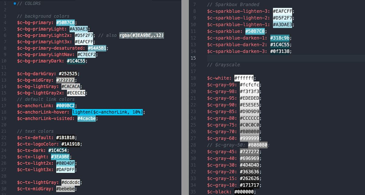
A running joke around our office is how one of our designers loves the color gray. So much so that, while the Sparkbox website uses only two hues, gray and our Sparkbox brand blue, we had roughly 25 different hex values of gray in random places on the site! We needed to consolidate. Over the course of three years with nearly two dozen contributing developers, the inevitable happened: sparkbox.com accumulated convoluted code, including a plethora of hex and rgba values, light/darken functions, and multiple variables or colors with barely any visible difference.
We needed a semantically named set of grayscale values that would encompass the existing hues and make it easy to add new grays.
The Art of Code
After consolidation, we were left with 17 grays to turn into variables, including black and white. Naming them gray-1, gray-2, … gray-17 did not give much information about the actual shade the variable represented. We were back to the phrase that naming CSS stuff is really hard. Drawing from a flashback to art school, we came up with a decision: we would borrow the names of alcohol-based art markers.
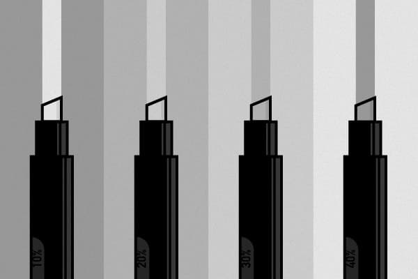
Prismacolor Markers are the envy of many art and design students. They aren’t cheap but are fairly well-known among creators. Prismacolor names their markers in percents—mostly, how much black pigment is in the marker. A 90% gray is very dark, while a 10% gray is almost white.
We reversed the percent names of the markers for the Sass variables, to match more closely with hex values (#000000, or 0%, being black). Prismacolor markers add pigment, while digital colors add white light. We set up a multi-use grayscale with all 17 of our grays, placing them on the percentage scale and choosing numbers in steps of 5% or 10% where possible.
See the Pen A Sassy Grayscale by Catherine Meade (@catheraaine) on CodePen.
Check out an updated CodePen that runs with a Sass function.
Taking the system one step further, we can use color functions in Sass to lighten pure black to the exact percentage gray. Fellow Sparkboxer Philip has done just that in a modified version of my gray pen.
Wonderfully Modular
I’ve since used the same scale on two other engagements. It is wonderfully modular; drop the whole set into your Sass and comment out the grays you aren’t using, in case you need them later. Good documentation will keep developers using the new variables, and there is no need to create extra variables for each new gray. Reaching beyond modern development and into traditional art methods allows us to write cleaner code that lasts project to project.
Check out Catherine’s Grayscale Sass on Codepen and the updated CodePen.
