Background
As you may have realized, it’s been several months since we’ve posted anything of significance on the design of our new website. (You might remember that we’re rebuilding and posting our progress on The Foundry). Well, we’re proud to say we’ve made a little progress.
Until recently, we had been thinking about the site as a whole in the context of the redesign. We had “finalized” the site design, and the next step was to build all the templates. Faced with an entire site overhaul and crammed schedules, the all-or-nothing scenario left us like deer in headlights. And it wasn’t true to the iterative nature we’ve aspired to adopt. So we started to think through how to break off smaller chunks of the site.
A New Approach
It was a lot to bite off at one time—when our top priority is client work—so we then tried to simplify the content in order to make it more reasonable to build in a timely manner. Unsatisfied with that approach, Ben recently brought up the idea of building the site literally one page at a time.
While we haven’t gone live with anything at this point, we’ve begun designing one of the lowest-level (but most visited) pages of our site: Foundry articles.
In our discussions recently, we’ve been asking ourselves if it’s possible to provide the user with the ability to select a “mode” that would prioritize some content over other content. For example, if a user primarily uses the site for reading Foundry articles, maybe there is a way to de-prioritize more “sales-y” content and accentuate Foundry articles. This thought made its way into the design of The Foundry article page.
New Foundry Design
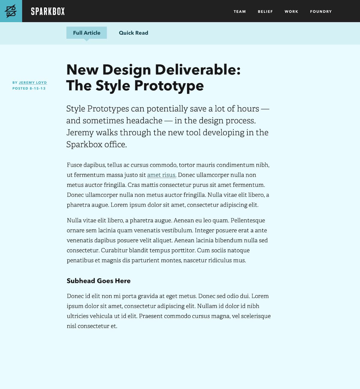
As we’ve designed it, a Foundry article can be read in two separate modes: “Full Article” and “Quick Read.” Here’s the design of the page, with both modes documented:
Full Article View
Quick Read View
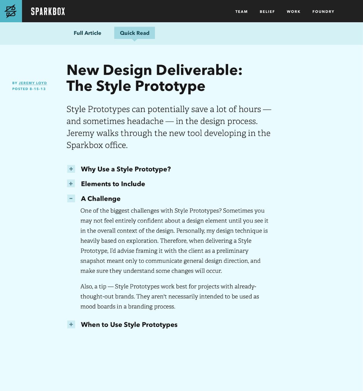
As you can see, Full Article mode is a traditional view, and Quick Read mode shows only the article subheads with a plus button to show the content for that section only. This allows the reader to quickly skim all the subheads in the post and make a decision on where to jump in. It makes it easy to access an answer you may be seeking that you know is in the article, without wading through a bunch of stuff you don’t care about.
We designed The Foundry article page previously, but the new design is considerably simpler. Gone are the tags, most recent article by this author, twitter conversation, etc.
What Do You Think?
We’re excited about seeing how this page will help users and would love to hear your feedback too.
