Supporting high contrast or “forced colors” mode is one way to make your website or app more accessible. While commonly referred to as Windows High Contrast Mode, this operating system setting is also found in Ubuntu, and can be emulated in Chrome and other Chromium-based browsers such as Brave or Edge, regardless of the operating system. This setting is for users that benefit from improved legibility of text and the readability of the UI, in their OS, apps, and websites. When enabled, browsers will automatically change the styles on the page in a significant way and change colors to various “system colors.”
While working on adding forced colors support, it’s key to deepen our understanding of who is using this feature and why. As developers, what we’re trying to achieve with our CSS customizations is important here. So is the ever evolving CSS spec and what it has to say about system color pairs.
Respecting the User’s Choice
While the operating system includes themes (e.g. a dark theme, a light theme, and some variations), it’s important to remember that the user can customize these system colors in any way that they prefer. This quote from the Microsoft Edge Team highlights a key point:
“The name “high contrast” is actually a misnomer—users can set their theme colors to whatever they prefer, including themes that result in lower than common contrast levels.” – Microsoft Edge Team [Source]
People who are using this mode or feature are doing so for different reasons. It could be:
Low vision or photosensitivity
Eye injuries or conditions where there can be a hazy effect caused by bright white light
Reducing eye strain
Just a preference for using this mode, for example, at night to reduce the amount of light emanating from their screen on websites that don’t have a dark theme
Keeping that in mind, what are we as website creators trying to achieve with our customizations? We need to make sure that any system colors we change will maintain legibility. We’re also trying to make sure that boundaries and interactive elements are clear and that, in general, the UI has not become less usable as the result of the changes made by the browser—especially as those changes may conflict with how our components are structured or styled.
The Importance of System Color Pairs: You’re Not Picking From a Color Palette
When I first started working on forced-colors mode updates for various components, I found myself referencing the following CSS specification quite often. While some of the official specs may not be as easy to read as the MDN Web Docs, this one is worth reading and keeping handy as it provides a bit more information:
W3C: CSS Color Module Level 4: System Colors and System Color Pairs
You might notice that this is labeled as a “draft” spec. The original system colors from earlier versions of CSS that emulated native operating system colors have been deprecated. This latest spec is being adopted fairly quickly by web browsers. It is important to note that it is still evolving rapidly, and that four new system colors were added to the spec in 2021 and 2022. It is likely that there will be more adjustments to come as the dust settles.
This CSS Color Module Level 4 specification by the W3C lists out all of the available system colors. It also lists out which system color pairings of background and foreground are expected to be legible.
Authors may also use these keywords at any time, but should be careful to use the colors in matching background-foreground pairs to ensure appropriate contrast, as any particular contrast relationship across non-matching pairs (e.g. Canvas and ButtonText) is not guaranteed.
It may be tempting for designers or developers to start picking from the list of colors as if it were an overall palette to mix and match. Especially since the number of available colors we have to work with is limited. Of course we all want things to still look good and as much like their original design as possible! But as the above quote highlights, along with the fact that users can change their colors and color themes, ensuring contrast and legibility through color pairings is one of the top priorities.
What Does Customization Look Like in Practice?
In general, we want to leave as many defaults as possible and avoid overriding. It only becomes necessary to make changes when what’s on the page becomes unusable, invisible, or hard to see. How we customize our website or app’s styles is fairly easy with CSS. The tricky part can be deciding what to change and getting around what the browser has decided to change.
How Styles are Tested
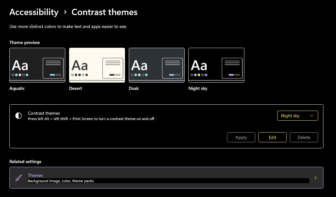
To test what styles look like on a web page, you’ll need to either turn on forced-colors mode emulation in a Chromium-based browser, or enable a mode within the operating system. In Windows 10, this setting is called “High Contrast” and in Windows 11 it is handled by “Contrast Themes.” Manual testing is important to view how the operating system may be affecting the page, along with how interactive elements and components behave, including how focus and keyboard focus is communicated.
A remote desktop accessibility testing service like AssistivTunnel can be used to test on Windows, if you do not have a Windows PC. I’ve found that I can’t fully rely on the Chrome emulation yet, as some things can look slightly different in Windows with high contrast mode enabled.
The Browser Makes a Lot of Big Decisions by Default
The browser is going to be assigning a lot of defaults to everything on the page based on the HTML elements used and other factors.
The MDN web docs page has a list of some of the CSS properties that are affected. One change that website creators are often dealing with is that transparent borders are forced to be opaque, and box-shadows are simply gone. If you’re relying on the box-shadow property to ensure design separation between your elements, you may need to look at other style changes, such as adding or increasing the size of the border.
Interactive States and CSS Example
Here’s a basic example of how some color customizations might be done:
:root {
  --selected-item-background: #F0F8FF;
  --selected-item-color: #000000;
}

.selected-item {
  background-color: var(--whcm-selected-item-background, var(--selected-item-background));
  color: var(--whcm-selected-item-color, var(--selected-item-color));
}

@media (forced-colors: active) {
  .selected-item {
    --whcm-selected-item-background: Highlight;
    --whcm-selected-item-color: HighlightText;
  }

 @supports (color: SelectedItem) {
    --whcm-selected-item-background: SelectedItem;
    --whcm-selected-item-color: SelectedItemText;
  }
}
In this example, the colors are set on a class using CSS custom properties. The high contrast custom properties are only defined and used when forced-colors is active. With the var() function, a second fallback value can be defined after the comma to provide a value when the first variable is invalid or undefined. With the high contrast custom properties first in the fallback chain, they will be used if defined, otherwise it falls back to using the regular color custom properties defined here in :root.
Displaying interactive states, borders, and selected items can get a little tricky, as we’re limited in what colors are available. Sometimes the contrasting color to the background may be used on an outline or border. Looking at HTML elements with default browser styling in high contrast mode, it’s apparent that the practice of using Highlight for some focus, hover, and selection related outlines and backgrounds is common.
More recently than Highlight was added to the initial spec, SelectedItem and SelectedItemText were added, which is why I am putting them behind an @supports here for good measure. This is an example of having a fallback for new system colors as they may become available. AccentColor and AccentColorText are also even newer additions that could be used in a similar way.
Should You Be Wary of forced-color-adjust?
When you use the CSS property forced-color-adjust: none on an element, the user agent (browser) will no longer make its automatic adjustments to colors in forced-colors mode. Only use this if you absolutely have to, and have made sure to set any necessary system colors. I was afraid of using it at first, but there are quite a few situations where it is necessary.
For example, you may want to set this property to none if you are showing color swatches and need the actual color to appear. Or if you can’t get around needing to show a border as transparent or using a box-shadow as a border.
Another unusual feature of WHCM is the appearance of a “text backplate” or “readability backplate” in some situations. It’s common with text on top of an image, and I’ve seen it in table cells. This is an extra black or white background that renders behind the text and in front of the background to help ensure contrast. This rendered background currently does not show up in the inspector when inspecting the DOM, which makes it hard to debug. If you’re wondering, why is there a black background behind the text but no CSS appears to be causing it, this may be the culprit. This sort of automatic adjustment can also be disabled with forced-color-adjust when necessary.
Other Ways to Support More Users and Give Them a Better Experience
Supporting as many users as possible starts with the basics of accessibility testing, including things like checking color contrast ratios on the page and ensuring that the code being written has enough browser support.
There are many other ways to support different user preferences through CSS, including prefers-color-scheme, prefers-contrast, or prefers-reduced-motion. Supporting high contrast mode is just the tip of the iceberg. As the official spec has started to settle, and Chromium version 98 added forced-colors emulation, I expect that more attention will be placed on supporting this accessibility feature.
