Recently Sparkbox had an opportunity to work on a unique project for Dayton Power & Light. They wanted us to build a display to show the public information about the power generation of a nine-acre solar array they had installed. In other words, they asked us to build some standalone software that would visualize the data in a fun way, with the most important feature being “Make it look cool.” This is the type of project that gets us very excited.
When the project was first brought up we instantly wanted to find a way to do data visualization using web standards and basic web technologies. We weren’t exactly sure how we were going to accomplish it, but believed we could figure it out. It’s not often that we get to build a website that only needs to work in one browser and on one computer that just had to look amazing.
So we embarked on the design. The designer was instructed to not have any mercy because of the technology we had chosen to use. In the end, even we were surprised how much the the final product looks like the Photoshop file. The power of JavaScript constantly amazes me. Things that were not possible even five years ago with JavaScript can be done today.
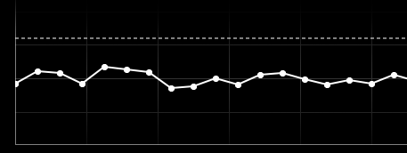
The parameters were that everything needed to be housed on a single computer. Since we decided to use web technologies we turned that computer into a isolated web and database server. Using PHP, Apache and MySQL we very quickly had a basic web server up and running. After the HTML template was coded we began the journey of using JavaScript to provide visual interest. Through the power of the JavaScript libraries jQuery and Rafael things quickly came to life. We also found a marquee jQuery plug-in that allowed us to show scrolling text. The challenging part of this project was the JavaScript required for a line graph. We wanted this graph to animate and be configurable. This required us to change the way we thought about the data.
There were a few moments during this project that different people in the office started to doubt if we could pull this off, but in the end I think it turned out wonderfully.
Here’s a few pics of the end result:


