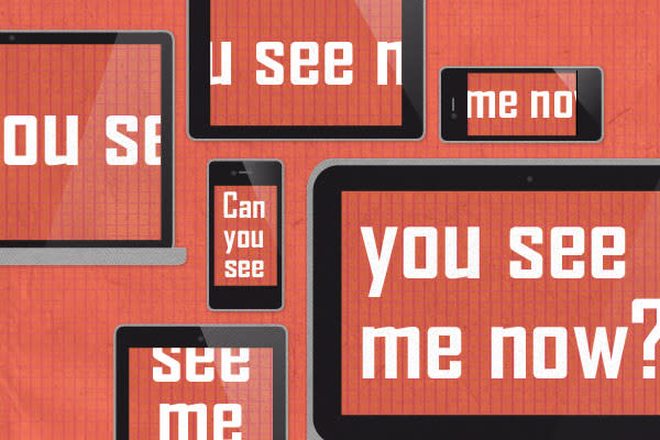
Structuring a Responsive Stylesheet
Organizing your stylesheet is difficult enough. Adding responsiveness adds a whole new level of complexity. Take a basic look at how we've done it on past projects.
Read MoreWe are rebuilding our site—live at building.seesparkbox.com. Join us, real-time, as the site evolves. It will be ugly at times. Sometimes it will be downright broken. But it will always be transparent and real. You can even check under the hood of the public repo on Github and share your ideas. Crazy, are we? Read why we're doing this.
The Foundry is our place to share articles, tutorials, events, and more. Search for a topic or just read everything.
Web design and development for beyond the desktop. Ben will be sharing about prototyping style.
Two-day conference full of intensely educational speakers who care about code, content, usability and design.
| Posted by Ryan Buttrey
Organizing your stylesheet is difficult enough. Adding responsiveness adds a whole new level of complexity. Take a basic look at how we've done it on past projects.
Read More| Posted by Ryan Buttrey
Why it's important to increase the text size of a responsive site at smaller resolutions.
Read More| Posted by Ryan Buttrey
Last week in the Sparkbox office, the question came up whether or not it is necessary to use lists inside the HTML5 nav element.
Read More| Posted by Ryan Buttrey
Here's how to target the iPhone 4 in a media query and replace the background images with hi res images.
Read More