
You’re probably aware that not all browsers support media queries. IE8 and below (plus a few other older browsers) simply can’t see styles that are cloaked in media queries. If we build a responsive site from small size up, these browsers will download all of our styles, but they will only be able to comprehend the stuff outside of media queries. If your project calls for a good experience in these browsers (many projects nowadays still do), this won’t work. You’re going to need a way to serve up these styles in a way that these elderly browsers can digest. Adam, Ben, Rob and I put our heads together to come up with a solution.
Respect Your Elders
One way to accomplish this is by outputting two different stylesheets—one for browsers that support media queries and one for those that don’t. In other words, generate one stylesheet that contains media queries, and generate one that strips off the crunchy media query shell but leaves the creamy CSS center. In effect, this will apply all of our media queries, giving users of old browsers the “desktop‐size” experience they expect. Through the power of preprocessing, we’re able to generate these two stylesheets and only write the code once.
We can do this with a surprisingly simple mixin. But first we need to talk about our overall style structure.
All Your _base
Hopefully, you’re familiar with the concept of @import rules in Sass. If so, skip this paragraph. If not, here’s a refresher: Sass treats the @import rule a little bit differently than plain old CSS. @import in CSS will cause the browser to make an additional request for the URI that follows it. In Sass, this inclusion happens at compile time. It simply looks for the file following the @import and drops it in place of the import. This means you can split up your styles across multiple files for the sake of organization.
The @import rule understands two kinds of files: whole files and partial files. Whole files are rendered out into CSS files by your Sass compiler. Partial files are not. Their only purpose is to be imported by other files. To denote a file as a partial, simply prepend an underscore to its filename. For example, rename filename.scss to _filename.scss. Also, when you are @import‐ing a partial into another stylesheet, you can leave out the underscore for the sake of simplicity. Your precompiler is smart like that.
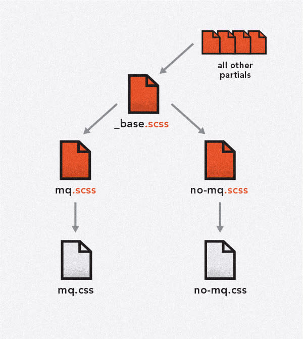
Keeping in mind the way @import works, we’re able to split up our styles across many different partials and import them into a single base file. This file is basically a manifest of all the files that will compose our rendered stylesheet. It imports mixin libraries, variables we’ve set, and most importantly, the styling for components of our pages. Let’s call this file base.scss (which will render out to base.css).
Usually, this is the only file that we’d output and link to in our HTML. However, we want to output two CSS files: one that contains media queries and one that doesn’t. This means we’ll have two rendered files. Let’s call their Sass files mq.scss and no-mq.scss (they will render out to mq.css and no-mq.css).
Now we’ll turn the base.scss manifest file into a partial by renaming it to _base.scss. This way we can still manage only one list of all the partials we’re including. mq.scssand no-mq.scss import _base.scss, then _base.scss does all the heavy lifting. Swell.
Now that we’ve defined the overall structure of our styles, we can talk about the mixin we’ll be using to create media queries that we can switch on and off per output file.
Meet SB‐Media
$no-mq-support: false !default;
$serve-to-nomq-max-width: 60em;

@mixin sb-media($query) {
  @if $no-mq-support{
    @if $query < $serve-to-nomq-max-width {
      @content;
    }
  } @else {
    @media ( 'min-width:' + $query ) {
      @content;
    }
  }
}
The mixin is simple enough that you can probably tell what it does by giving it a quick look-over. If $no-mq-support is false, we output its contents in a min‐width media query. Otherwise, we check if the $query is less than $serve-to-nomq-max-width. If it is, we output the contents, sans media query.
Usage
Let’s say I want to style a box. I want this box to start off blue but turn purple at 45em. Here’s what our files look like:
mq.scss
@import "base";
no-mq.scss
$no-mq-support: true;
@import "base";
_base.scss
@import "mixins"; // contains sb-media mixin
@import "box";
_box.scss
.box {
  background-color: blue;
  @include sb-media(45em) {
    background-color: purple;
  }
}
When we compile these files, it will output the following two CSS files:
mq.css
/* I'm rendered CSS */

.box {
  background-color: blue;
  @media (min-width: 45em) {
    background-color: purple;
  }
}
no-mq.css
/* I'm rendered CSS */

.box {
  background-color: blue;
  background-color: purple;
}
$no-mq-support is a flag that says whether we’re using this to generate stylesheets for browsers that do or don’t support media queries. Since it defaults to false, we only need to set this to true in no-mq.scss.
$serve-to-nomq-max-width is the cutoff point at which we stop outputting styles in this mixin. This prevents fancy large-screen styles from being included for old browsers that have no idea how large they are.
You can clone our SB-Media repo if you’d like to start tinkering with it right away. This mixin is intentionally left dead simple so that you can easily copy/paste it among your other mixins and modify it to fit your product. You may find yourself in need of a fuller-featured plugin such as Breakpoint to manage your media queries (Breakpoint can provide this same functionality). Pick a solution that fits your needs.
Tinkering with Linking
Now we’re successfully generating two CSS files. However, we only want to serve one file at a time. mq.css to modern browsers, and no-mq.css to browsers that don’t support media queries. We never want to serve both.
There’s a multitude of different ways that we can link these files. Only a few of these methods will cost a single HTTP request and a single download. Here is one approach:
<!--[if (lt IE 9) & (!IEMobile)]>
  <link href="c/no-mq.css" rel="stylesheet">
<![endif]-->

<!--[if (gte IE 9) | (IEMobile)]><!-->
  <link href="c/mq.css" rel="stylesheet">
<!--<![endif]-->
If you’re familiar with HTML5 Boilerplate, this might look a bit familiar. It’s the same technique that’s used to add IE version‐specific classes to the <html> element. The magic behind this method lies in IE’s conditional comments. This will serve no‐mq.css` to IE8 and below, while serving mq.css to every other browser. It’s important to note that the unused files in either of these cases isn’t ever downloaded or applied.
The main caveat to this approach is tying the lack of media query support to old IE. IE8 and below aren’t the only browsers that don’t support media queries, but they’re arguably the most popular of the bunch that are still being used. Again, you may want to change this approach and tailor it to fit your project.
As much as we web developers like to ignore the fact, people still use old browsers. This doesn’t mean we can’t use shiny new browser features. It just means that we should use them responsibly.
