
A Quick Intro
Before you start reading, watch this one minute clip on YouTube.
Child: Do not try and bend the spoon. That’s impossible. Instead, only try to realize the truth.
Neo: What truth?
Child: There is no spoon.
Neo: There is no spoon?
Child: Then you’ll see that it is not the spoon that bends, it is only yourself.
The Rabbit Hole
I still love this movie. These days, working on the web can make us feel a bit like Alice, “tumbling down the rabbit hole.” Now, I’ve been speaking about embracing the fluid nature of the web at conferences and workshops for a year. In that time, clearly the most common question I’ve received is:
“What breakpoints should I use?”
This has been so confounding to me. I think I tried once to really dig into a site’s analytics as a guide for what breakpoints I should use. Of course, that didn’t work. The numbers I determined based on analytics didn’t line up with the layouts where my content and design weren’t working well together, so I ditched that idea and just started putting breakpoints where the design and content dictated. However, I was still stuck on the idea that we needed to make these decisions for the system as a whole. If I decided early on that 34em was a breakpoint for this “page” it should remain so for the “system.”
Now I wonder if we’re trying too hard to bend the spoon instead of realizing the truth. There is no breakpoint.
Given the tools we have at our disposal, particularly things like Breakpoint for SCSS and the data which shows almost imperceptible differences in performance for various media query structures, I think there’s a better way.
By placing our media queries inline, immediately following the smallest styles, we can group styles by the components they impact and not worry about following a specific set of breakpoints. Here’s how that might look:
nav a {
  display: block;
  padding: .5em 0;

  @include breakpoint(23em, $no-query:".no-mq") {
    padding: .25em;
  }

  @include breakpoint(41.5em, $no-query:".no-mq") {
    width: 48%;
    margin: .25em 1%;
    float: left;
  }
}

footer {
  padding: 1em 5%;

  @include breakpoint(40.25em, $no-query:".no-mq") {
    padding: 1em 2%;
  }

  @include breakpoint(71em, $no-query:".no-mq") {
    padding: 2em 1%;
  }
}
When the nav component needs to change, we change it—independent of when the footer component needs to change. Obviously, this applies to any components in your site/system. And isn’t this how it should be? Building stronger component independence makes for more modular code. Modular code is more maintainable and more extendable.
A Bit Of Technical Explanation
The breakpoint mixin will place the styles in the generated CSS twice—once scoped to the media query and once scoped to whatever selector string you pass with $no-query (“.no-mq” in my example above). This allows us to be selective about which styles we serve to user agents that don’t support media queries. In the above case, I’m assuming there is a class on the html element (think Modernizr) to help us know when the UA supports media queries. This example is showing how we might choose to serve a larger resolution layout to browsers that don’t support media queries.
An Example
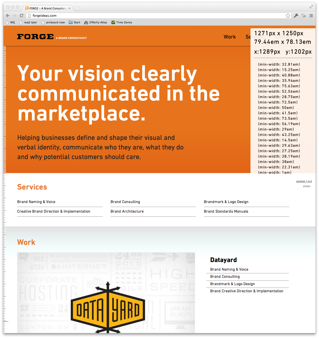
We’re just now starting to integrate this thinking into our work here at Sparkbox. Recently, we redesigned forgeideas.com with these techniques. Below is a screenshot with Rob Tarr’s Media Query Bookmarklet running (in the transparent white box on the top-right corner of the browser window). You can see the various media queries that are currently firing. Notice that they are not consolidated in any way. This site was a fairly simple and quick build, but it gave us an opportunity to explore these techniques. We learned that this kind of approach frees us up to make more natural decisions in our responsive layouts. We like it quite a bit.
As designers and developers, content authors and content strategists, it’s in our nature to try and control the web in a way it doesn’t want to be controlled. We’ve been doing this as long as we’ve been fixing widths. The past two years have been encouraging as our industry has taken steps—some large, some small—toward embracing the web’s fluidity more fully.
Like Neo, I can’t help but think it’s you and I that need to be more flexible, not the medium we build with.
